User interface
Use this topic to learn about the Collibra user interface, key screen elements, how to arrange list items, and how to navigate efficiently using your keyboard.
About latest UI and classic UI
By default, Collibra uses the latest user interface (UI). However, some environments may still use an older version called the Classic UI.
With the exception of this topic, the documentation only applies to the latest user interface. If a feature does not work in the classic UI, the documentation has a prerequisite asking you to check that you are on the latest UI.
With Collibra 2024.05 comes the latest user interface (UI).
- The apps icon has moved to the left side for easier access.
- The asset type icon, asset name, and breadcrumb trail are also available on the left side.
- You can find important information about data in the At a glance sidebar. This includes the type of data, when it was last changed, and who is responsible for it. If the At a glance sidebar is hidden, click
.
- The main tab pane has moved to the top of the page, making space for a table of contents tab pane, to help you easily find the various sections.
Example
- You can focus on the content you need by using the Show empty optional values option to show or hide all empty values that are optional to complete.
- You can use the right side of the page to take control, with options to perform an action via the Actions menu or More icon , open the At a glance sidebar, or show tasks.
- In-page editing is allowed. You can edit content directly on the page by clicking the item you want to change.
Tip To discard your updates, press the ESC key.
- All the available characteristics are already on the page for you. This means the Add Characteristics button is no longer shown. If you notice something missing, ensure that the Show empty optional values option is selected to show all available fields. If the characteristic is still missing, contact your administrator.
- Administrators can configure the characteristics for the page via a tailored asset page experience, giving them more granular control over data presentation. They can navigate to the asset type page (via the link on the page) and decide which characteristics are available for the asset via assignment, and then click Edit layout to arrange these characteristics on the asset page, group them by sections, and even choose to hide certain characteristics from the page.
For information on how to enable the latest UI, go to Enable the latest user interface.
FAQ on the latest UI
- The latest UI introduces redesigned page layouts along with updated default color schemes.
- Some main navigation buttons have been relocated. For example, the Application Menu icon has moved from the right side of the page to the left.
- On asset pages, certain information has moved to other tabs and submenus.
- The way in which you can customize asset pages has changed. You can define the fields and the layout of the asset pages.
- New features have been made available, such as Tailored Asset Pages, AI Governance, Data Marketplace in Search, Data Notebook, and more.
For a comprehensive list of changes, go to What is different when the latest UI is enabled?
On individual pages within the documentation, you can find an option to switch the information between the classic UI and the latest UI, for example, Screen elements in the UI.
Tip Collibra often shows complex information, including large data tables. To ensure optimal viewing, use a screen width of at least 1,200 pixels. Smaller screens widths are not supported.
Tip To ensure the best experience when using the latest UI, we recommend using the latest browser version and configuring your network settings to allow for HTTP/2 or HTTP/3. For more information, go to the Collibra Support center.
- For commercial customers, the latest UI is enabled by default in non-production environments starting from 2024.05. In production environments, the latest UI is enabled starting from 2024.10, unless customers have raised blockers with the Customer Success team. For new commercial customers, the latest UI is enabled by default in all environments.
- For Collibra Cloud for Government, the latest UI is disabled by default in both non-production and production environments.
To enable the latest UI, go to Enable the latest user interface.
Additionally, what should I do if I don’t find the characteristic I want to complete?
In the latest UI, the Add characteristics button is no longer available on the asset page.
Instead,
- Use the Show empty optional values switch to view all fields on the asset page.
- If the characteristic is still not available, use the global assignment and the layout editor to add the characteristic.
Starting from Collibra 2024.05, the latest UI has a similar behavior compared to the classic UI concerning the minimum cardinality. Characteristics (attributes and relations) with a cardinality higher than 0 are always shown on the asset page even if they are empty.
For information on the behavior in the previous releases, go to the Help Center.
Brand and theme elements can be applied via the Customizations feature. System administrators can change the logo and the color of branded components such as primary buttons and tabs.
Important The latest UI doesn’t support styling that was previously applied via CSS override files.
We have created the most common customizations as in-product features. Check this knowledge article in the Help Center for alternative ways to apply some of the previously applied customizations in the latest UI. If your customization is not covered in the article and you would like us to consider supporting it, create a ticket on the Collibra Ideation Platform.
With the latest UI, we implemented more modern and secure libraries. As a result, some of the patterns in tables, text editors, and dashboard widgets have changed. For example, to edit a table cell, you can double-click anywhere within the cell, rather than using the pencil icon within the cell. As another example, the source code and backend of our rich text editor utilizes different HTML markup than in previous versions. For more information about changes like these, go to What is different when the latest UI is enabled?
Yes, however, currently there is no link between any classic UI branding customizations and the latest UI branding customizations. Customizations are also stored in a different way. This means that any changes to logos or component colors in the latest UI will be lost if you restore a backup with a classic UI.
If you open an asset preview in standalone Data Marketplace or Data Marketplace in Search, the predefined asset preview layout is applied. However, if you open the asset page, the tailored asset pages are shown.
The way in which administrators can create a meta model in the latest UI hasn't changed. Only the appearance of the pages has changed.
Screen layout
| No. | Element name | Description |
|---|---|---|
|
Application logo |
Open the homepage. |
|
Applications |
Open another application, such as:
Product capabilities with a dedicated entry point on the application menu or that function as standalone are marked as Product in the products and features overview. |
|
Browse |
Open the browse pane, which contains organization, asset views, and dashboards. |
|
Search | Search for any resource in Collibra using a search box. |
|
Create | Create any resource from any location. |
|
Tasks | Check how many workflow tasks are awaiting your attention and manage those tasks from the Tasks page. |
|
Activities |
Check the Collibra activities and view the history of all the jobs you started. |
|
Data basket | Request access to assets. |
|
Help |
Access What's New, Product Documentation, Product Resources Center, Collibra University, Collibra Marketplace, and Support Portal. If you are an administrator, you can also access API documentation. |
|
Avatar | View and modify your profile, sign out, and report a problem. |
|
Subtab |
Open one of the pages of the current application. |
|
View selector |
Switch between views. |
|
View toolbar |
Manage the current view. |
|
Action buttons |
Perform actions on the assets that you selected in the view or start a workflow. |
|
Content toolbar |
Manage the resources in the current view. |
|
Filter pane |
Filter the resources in the view. |
|
Table or set of tiles |
See the resources in the current view in a table or as tiles. |
|
Rows per page | Change the number of rows or tiles per page, or switch to another page. |
Screen elements in the user interface
The Collibra user interface contains a number of common elements that appear throughout the product. You can navigate through Collibra using your mouse or keyboard.
Arrange list items
On some pages and in some dialog boxes, you can arrange list items to change the order of their appearance on the page, for example, when adding fields to a view or editing an asset type assignment.
In dialog boxes and on regular pages, you can have lists that can be arranged. You can arrange the list items in the same way.
|
In a dialog box |
On a page |
|---|---|
|
|
Moving items by dragging and dropping
The easiest way to move items up or down is typically by dragging and dropping:
- Click
or in front of an item and hold down the mouse button. - Move your mouse to the desired location in the order.
- Release the mouse button.
Navigate using your keyboard
You can navigate using your keyboard.
| Action | Description |
|---|---|
| Moving the focus point |
The focus point indicates the current focus of your navigation. If you hover your mouse pointer over an element, you sometimessee the background change, or text becomes underlined. When you use the keyboard, the same effect takes place as when you hover your mouse pointer. However, rather than moving your mouse, you can jump to the next element using the tab key on your keyboard. You can also press shift + tab to jump to the previous element. |
|
Clicking and activating screen elements |
Press enter to activate an element when it is the focus point. This allows you to press a button or open a link, using your keyboard rather than clicking. |
| Opening and closing dialog boxes and pop-ups |
Click any dialog box or pop-up to open it. You can navigate in the dialog boxes and pop-ups just as you would anywhere else. To close it, press escape. |
| Selecting and clearing checkboxes |
Navigate to a checkbox and press the space bar to select it or clear it. |
|
Selecting radio buttons |
Use the arrow keys on your keyboard to select radio buttons. Navigate to the radio buttons using the tab key, then press ←, →, ↓, or ↑ to change which radio button is selected. |
|
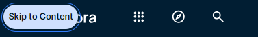
Skipping repetitive sections |
Most pages in Collibra Platform contain repetitive sections at the top of the page, such as the main menu. You can skip this section using the Skip to content button. This button is the first available element when you start navigating in a repetitive section using your keyboard.
|
| Navigating tables |
Use the arrow keys on your keyboard to navigate within a table and interact with table elements, such as links. Navigate to the table using the tab key, then press ←, →, ↓, or ↑ to navigate within the table. Press enter to modify editable table cells. Press shift + enter to expand or collapse expandable table cells. Note The virtual cursor feature in screen readers may not work optimally with Collibra's custom implementation. Temporarily disable the virtual cursor when navigating tables in Collibra. For the JAWS screen reader, switch the virtual cursor by pressing JAWS key + Z. |
By default, Collibra uses the latest UI. However, your administrator may have switched to the classic UI.
Screen layout
| No. | Element name | Description |
|---|---|---|
|
Home button | |
|
Navigation browser |
Open the Browse pane. |
|
Search field | Search for any resource in Collibra. |
|
Create any resource from any location. | |
|
Shopping basket | Request access to assets. |
|
Tasks indicator | Check how many workflow tasks are awaiting your attention and manage those tasks from the My tasks page. |
|
Activities tracker |
Check the Collibra activities and view the history of all the jobs you started. |
|
Info |
Get access to the product documentation, to Collibra Product Resource Center and University, and to the Collibra support portal. Note If you have the Sysadmin role, you can access the API documentation. |
|
Avatar | View and modify your profile, sign out, and report a problem. |
|
Application menu |
Open another application:
|
|
Submenu |
Open one of the subpages of the current application. |
|
View selector |
Switch between views. |
|
View toolbar |
Manage the current view. |
|
Filter pane |
Filter the resources in the view. |
|
Action toolbar |
Perform actions on the assets that you selected in the view or start a workflow. |
|
Content toolbar |
Manage the resources in the current view. |
|
Table or set of tiles |
See the resources in the current view in a table or as tiles. |