About the data quality dashboard
You can use the dashboard to:
- Track what percentage of your data is actively monitored.
- See whether data quality is improving or declining over time.
- Identify which connections or dimensions have the lowest quality scores.
How the dashboard works
The dashboard is a collection of widgets, each focused on a specific aspect of data quality. Admins compose and publish dashboard pages from a shared widget library. Once published, the layout is available to everyone in your organization.
If you do not have the Manage Data Quality Dashboards global permission, you can view published dashboard pages but cannot add or remove widgets.
You can narrow the data shown across all widgets using global filters for connection, monitor type, and date range. Changing a filter immediately refreshes all applicable widgets.
Overview of the data quality dashboard user interface
The following image and sections describe the key functional areas of the data quality dashboard page.
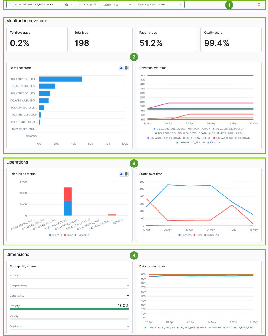
Filters
Four global filters ( ) apply across the dashboard. Selecting any filter immediately refreshes all applicable widgets. The filters are configurable using the Page Editor.
Connection: Select one or more data quality connections from the drop-down list. The list shows only the connections you have permission to access and includes details only from cached connections. If no connection is selected, the dashboard shows data for all accessible connections.
Monitor type: Select one or more monitor types:
- Empty
- Null
- Row count
- Rule
- Schema change
- Uniqueness
- Max value
- Mean value
- Min value
- Data type
- Unique range
This filter applies to the Quality score widget in the Monitoring coverage section and to the Dimensions widgets. It does not apply to the Monitoring coverage or Operations sections.
Date range and aggregation: Select a date range and an aggregation level. The aggregation level is either Daily, Weekly, or Monthly. These controls affect all time-series widgets. The Metrics summary and the Current Coverage chart are not affected by date aggregation.
Click  to save your filters as defaults.
Widgets
The dashboard is comprised of three sections of widgets that you can edit to meet your needs. Within the three sections of widgets are four UDQ-specific widgets, including:
Tip For UDQ bar charts and line charts, click a specific label in the chart's legend to remove it on the fly. Example
Monitoring coverage
The Monitoring coverage section ( ) helps you identify gaps in your monitoring strategy. It has 6 widgets for the connections and time range you select:
- Total coverage: The percentage of tables in your Edge connections against which at least one job has ran.
- Total jobs: The total number of job runs across your selected connections within the date range.
- Passing jobs: The percentage of jobs that meet or exceed your organization's passing score threshold. You define this threshold at Settings > Data Quality > Limits.
- Quality score: The percentage of passing monitors across all selected connections and monitor types. The Monitor type filter applies to this figure only.
- Detail coverage shows a horizontal bar chart with the percentage of tables that have active jobs, grouped by connection. Each bar displays the count of monitored tables against the total.
- Coverage over time shows a line chart with coverage percentage trends over the selected date range, plotted separately for each connection. The chart uses the last recorded value within each aggregation period, which is the most recent successful metadata sync on the final day of the aggregation window.
Operations
The Operations section ( ) shows the volume and status of jobs that ran over the selected time range. The charts in this section use a color-coded system to indicate job status:
- Success (blue)
- Error (red)
- Cancelled (green)
Job runs by status displays a stacked bar chart of total job runs, grouped by connection. By default, the chart shows the ten connections with the highest job volume.
Status over time displays a line chart of total job runs, grouped by job status. Each period shows the sum of all job runs that completed in that interval. If no jobs ran during a period, the value is zero. The widget does not carry forward values from previous periods.
Dimensions
The Dimensions section ( ) breaks down your overall quality score by dimension, and shows how those scores change over time.
Data quality scores displays horizontal bar charts for the overall score and for each individual dimension. By default, the dimensions shown on this chart are Accuracy, Completeness, Consistency, Integrity, Validity, and Duplication. Each bar shows the proportion of monitors in a passing state (green) versus a not-passing state (red).
Data quality trends displays a line chart with the overall score and each dimension's score over the selected date range. Each data point is a weighted average of all monitor results within the aggregation period. If no monitors ran for a dimension during a period, the chart shows a gap rather than a carried-forward value.
If you have removed all default dimensions, the widget displays a message prompting you to add dimensions before scores can appear.
- Review the monitoring coverage of your data sources.
- Explore your data sources and schemas.
- Add quick monitoring.
- Run a data quality job.