The AI Command Center Business dashboard provides a centralized, real-time overview of your organization's AI landscape, aggregating high-level metrics to monitor performance, risk, and governance health. The dashboard is an assembled collection of components, such as sections and widgets.
Prerequisites
To view the Business dashboard:
- You need a global role with the Product Rights > AI Governance global permission.
- You need a global role with the AI Governance > View summary dashboard global permission.
As an administrator, you can configure the dashboard to suit your needs. For complete information, go to:
Default dashboard configuration
The following image shows the default dashboard configuration.
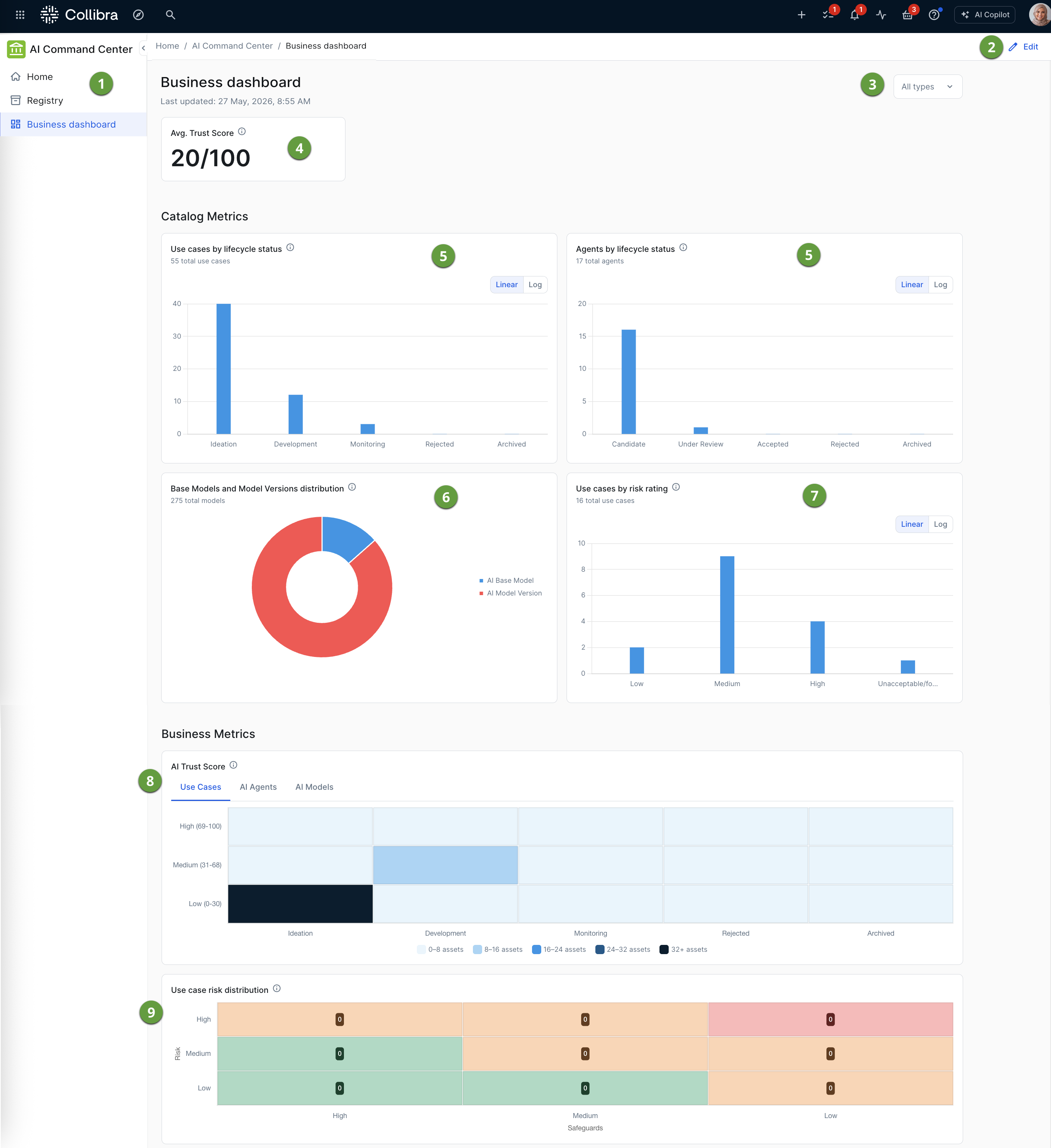
| No. | Component | Description |
|---|---|---|
|
|
Sidebar navigation | Tabs to access the AI Command Center landing page and registry. |
|
|
Edit button |
Allows administrators to configure the dashboard. For complete information, go to: |
|
|
Asset type filter |
Allows you to define the scope of the data you are viewing on the dashboard. 
You can select one or more, between AI Use Case, AI Agent, and AI Model asset types, and the data shown in the widgets adjusts to your selection. The dashboard treats them as a single combined pool for calculating the Avg. Trust Score and Lifecycle metrics. The default state, meaning no asset types selected - is the same as selecting all three asset types. If you select AI models, both AI Model Version and AI Base Model assets are counted. |
|
|
|
A widget configured to help users evaluate the maturity, safety, and operational health of AI assets. It shows the average Trust Score of all AI assets in your Collibra environment, with consideration of any asset type filter selections. |
|
|
|
A bar chart that shows the number of assets of a specific type, per lifecycle stage. Administrators can configure the widget for:
Only core phase asset statuses (lifecycle stages) are considered. For information about lifecycle stages and core phase asset statuses, go to About Lifecycle management and Configure the lifecycle stages for an asset type. |
|
|
|
A donut chart that visualizes the distribution of assets by type, as a ratio of the total count. |
|
|
|
A bar chart that shows the number of assets of a specific type, per risk rating. Risk ratings reflect the response to the "overall risk rating" question in the out-of-the-box Risks and Safeguards assessment. |
|
|
|
A heat map that correlates categories with qualitative ranges (Low, Medium, and High), to visualize asset density, per asset type, across different asset lifecycle stages. The qualitative ranges reflect the AI Trust Score settings, which can be edited to reflect what matters most to your organization. |
|
|
|
A matrix that cross-references use case risk levels with safeguard levels, to visualize the number of use cases at each risk-safeguard combination. Risk levels (High, Medium, and Low) are shown on the vertical axis, and safeguard levels (High, Medium, and Low) are shown on the horizontal axis. Risk ratings reflect the response to the "overall risk rating" question in the out-of-the-box Risks and Safeguards assessment. |


Drill-down exploration
The dashboard is designed for interactive exploration, allowing you to move from high-level metrics to specific asset details with a couple of clicks. When you hover your cursor over, for example, a colored section in a graph or chart, a tooltip appears, providing a precise breakdown of the asset count for that specific segment. This is particularly helpful on the linear or logarithmic scales, where exact numbers might be difficult to discern.
Beyond just viewing the numbers, these chart elements function as active links for deeper investigation. When you click on a bar or a donut slice, a dialog box shows a filtered asset view. This view shows all of the assets, such as the specific AI Models or AI Use Case assets, that make up the clicked data point. This transition from a visual summary to a granular registry allows you to identify which projects are, for example, "In Development" or marked as "High Risk", without having to manually search Data Catalog.
Linear and logarithmic scales
The choice between Linear and Log (logarithmic) scales determines how the vertical axis represents the volume of your AI assets. In the Linear option, which is the default, the distance between units remains constant, meaning the jump from zero to 20,000 is the same as the jump from 80,000 to 100,000.
As shown in the following example image, this is ideal for quickly identifying the high volume asset types in your environment. However, it often causes smaller volumes to look like empty, because their values are so small compared to the larger volumes.
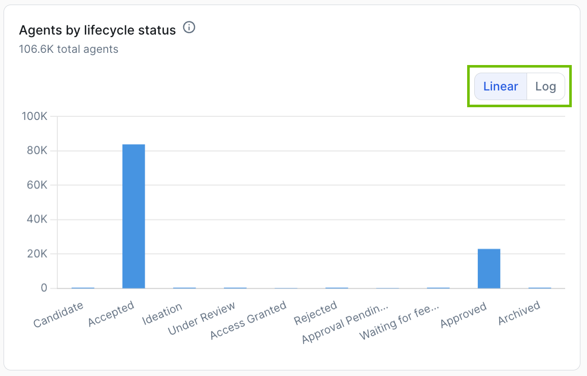
Switching to the Log (logarithmic) scale changes the axis so that each major increment represents a power of ten rather than a fixed sum.
The following example image is the log scale representation of the same dataset represented in the linear scale representation in the previous image.
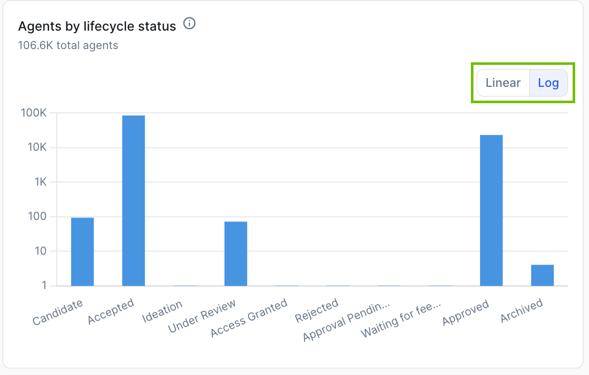
The log scale "stretches" the lower end of the graph, allowing you to see the relative distribution of smaller volumes that relatively disappear when compare to larger volumes.
While the Linear scale shows you the absolute scale of your workload, the Log scale is the better tool for a comprehensive health check, as it ensures that even asset types with very few assets are visible and comparable in the same view.