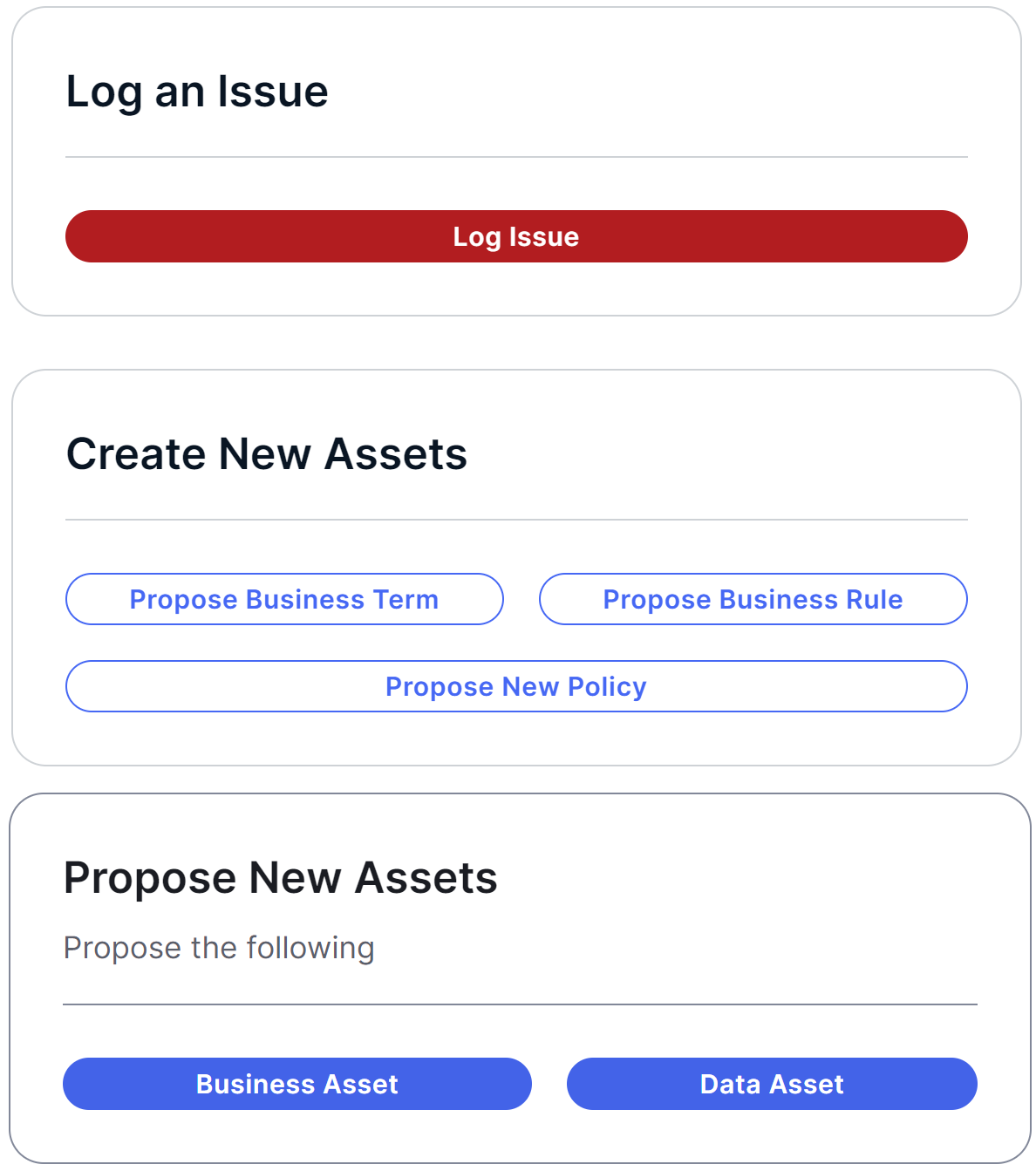
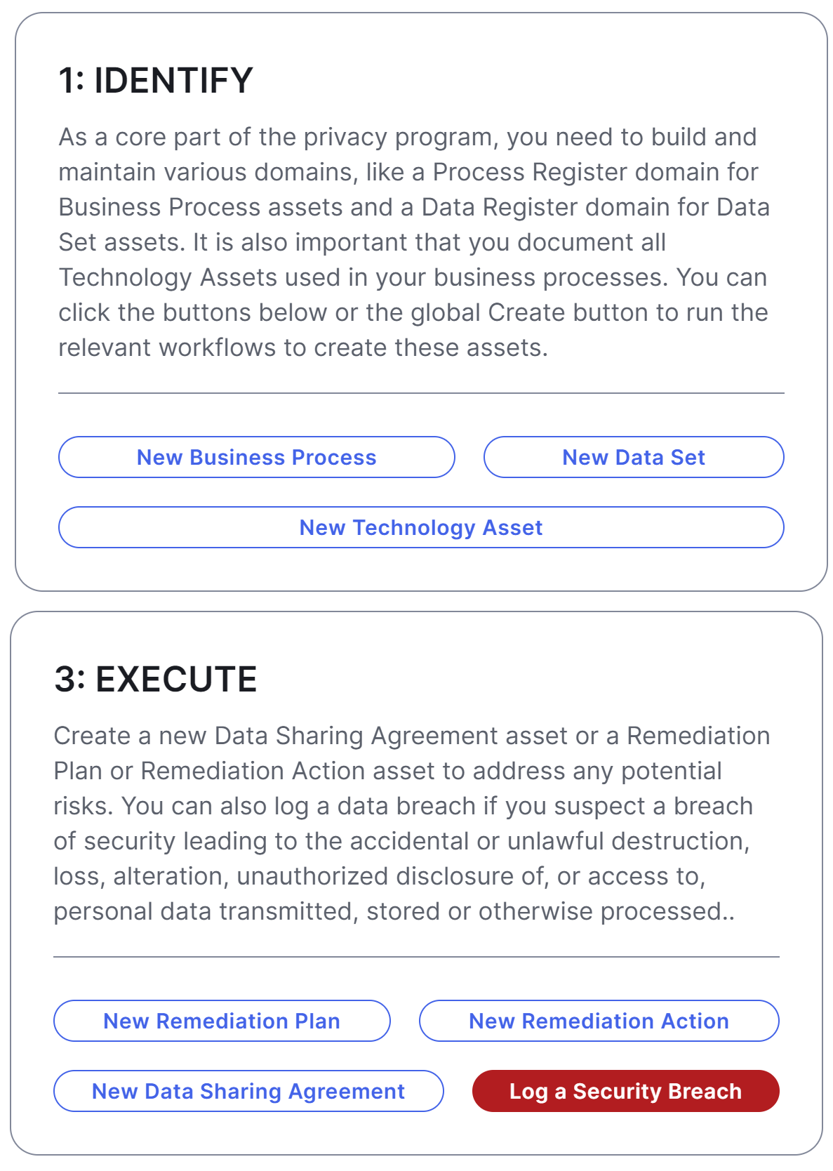
The Workflows widget on a dashboard enables you to start global workflows via buttons.

Prerequisites
- To manage your own dashboards: You have a global role that has the Manage your own Views, Dashboards, Search filters global permission.
- To manage another user's dashboards: You have a global role that has the Manage shared Views, Dashboard and Search Filter global permission.
Steps
- Open the widget for configuration.
Show more information
- Open the dashboard for which you want to configure the widget.
- Click
 → Edit Dashboard.
 - If needed, drag the widget from the Widgets section to the dashboard.
- On the widget, click
 → Configure.
- On the Workflow Buttons tab, select a workflow, and then enter the required information.
Field
Description Title
Label for the workflow button when it is shown on the widget.
Workflow
Global workflow that you want to start when the button is clicked. Button
Style for the button, based on the type of workflow. The following styles are available:- Outlined: A button typically used for secondary or less prominent actions. It has a visible border and a transparent background, unless the secondary button is customized via the Collibra settings.
- Alert: A button typically used for negative actions or warnings. It has a red background, and it can't be customized.
- Solid: A button typically used for primary or most prominent actions. It has a blue background, unless the primary button is customized via the Collibra settings.
Tip- You can change the position of a workflow button by dragging
to the required position.
- You can remove the workflow button you don't want to show on the widget by clicking
 .
. - You can use multiple Workflows widgets to group workflows that belong together, or to highlight important assets.

- On the Widget tab, enter the required information.
Tip You can use the Description field to explain to users why and when a certain action is required, or to set expectations on what happens after an action is triggered and completed. For example, you can specify the processing timeframe for a new term suggestion, indicating that it will be addressed within X business days, or communicate that you'll follow up via email to provide further updates.
- On the widget, click Save.
- In the upper-right corner of the page, click Save.