You can change the colors of the components in your environment via the Components section on the Custom Theme page.
The Quick Color Select Tool and Components sections affect the same components. However, the Quick Color Select Tool section offers a quick way to set colors for components, whereas the Components section allows for color selection at a more granular level for the same components. For example, in the Components section, you can also select a color for subcomponents, such as the active state for tabs or the background color for enabled switches.
- This topic contains certain terms related to the user interface. For information about these terms, go to User interface terminology.
- An example is shown in each subsection in the UI to enable you to visualize and interact with components as you customize them.
- To undo all your changes in a subsection, click Reset in the subsection.
- The colors you select in the Components section always take precedence over the colors selected in the Quick Color Select Tool section.
Primary Button
The Primary Button subsection enables you to select colors for the elements and states of primary buttons when they appear on a light background.

The following table describes the fields in the Primary Button subsection.
Primary Button on Dark Background
The Primary Button on Dark Background subsection enables you to select colors for the elements and states of primary buttons when they appear on a dark background.

The following table describes the fields in the Primary Button on Dark Background subsection.
| Field | Description |
|---|---|
| Background | Background color of primary buttons on a dark background. |
| Hover | Background color of primary buttons when hovered over on dark light background. |
| Active | Background color of primary buttons when being clicked on a dark background, to indicate that your interaction with the button is registered. |
| Text | Text color of primary buttons on a dark background. |
Secondary Button
The Secondary Button subsection enables you to select colors for the elements and states of secondary buttons when they appear on a light background.

The following table describes the fields in the Secondary Button subsection.
| Field | Description |
|---|---|
| Outline and Text | Border and text color of secondary buttons on a light background. |
| Hover | Background color of secondary buttons when hovered over on a light background. |
| Active | Background color of secondary buttons when being clicked on a light background, to indicate that your interaction with the button is registered. |
| Active Text | Text color of secondary buttons when clicked on a light background. |
Secondary Button on Dark Background
The Secondary Button on Dark Background subsection enables you to select colors for the elements and states of secondary buttons when they appear on a dark background.

The following table describes the fields in the Secondary Button on Dark Background subsection.
| Field | Description |
|---|---|
| Outline and Text | Border and text color of secondary buttons on a dark background. |
| Hover | Background color of secondary buttons when hovered over on a dark background. |
| Active | Background color of secondary buttons when being clicked on a dark background, to indicate that your interaction with the button is registered. |
| Active Text | Text color of secondary buttons when clicked on a dark background. |
Tabs
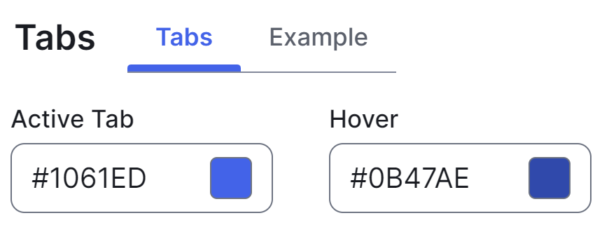
The Tabs subsection enables you to select the color of the active state of tabs when they appear on a light background.

The following table describes the field in the Tabs subsection.
| Field | Description |
|---|---|
| Active Tab | Text and indicator color of active tabs on a light background. |
Tabs on Dark Background
The Tabs on Dark Background subsection enables you to select the color of the active state of tabs when they appear on a dark background.

The following table describes the field in the Tabs on Dark Background subsection.
| Field | Description |
|---|---|
| Active Tab | Text and indicator color of active tabs on a dark background. |
Switch
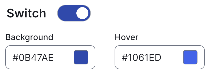
The Switch subsection enables you to select colors for the elements and states of switches.

The following table describes the fields in the Switch subsection.
| Field | Description |
|---|---|
| Background | Background color of switches when enabled. |
| Hover | Background color of enabled switches when hovered over. |
Stepper
The Stepper subsection enables you to select colors for the elements and states of steppers.

The following table describes the fields in the Stepper subsection.
| Field | Description |
|---|---|
| Active Icon Background | Background color of active steps. |
| Active Icon Text | Text color of active steps. |
| Completed Icon Background | Background color of completed steps. |
| Completed Icon Text | Text color of completed steps. |
| Hover Background |
Background color of step titles in non-linear steppers when hovered over. Tip A non-linear stepper is a stepper that allows you to move forward or back in the steps.
|
Date Picker
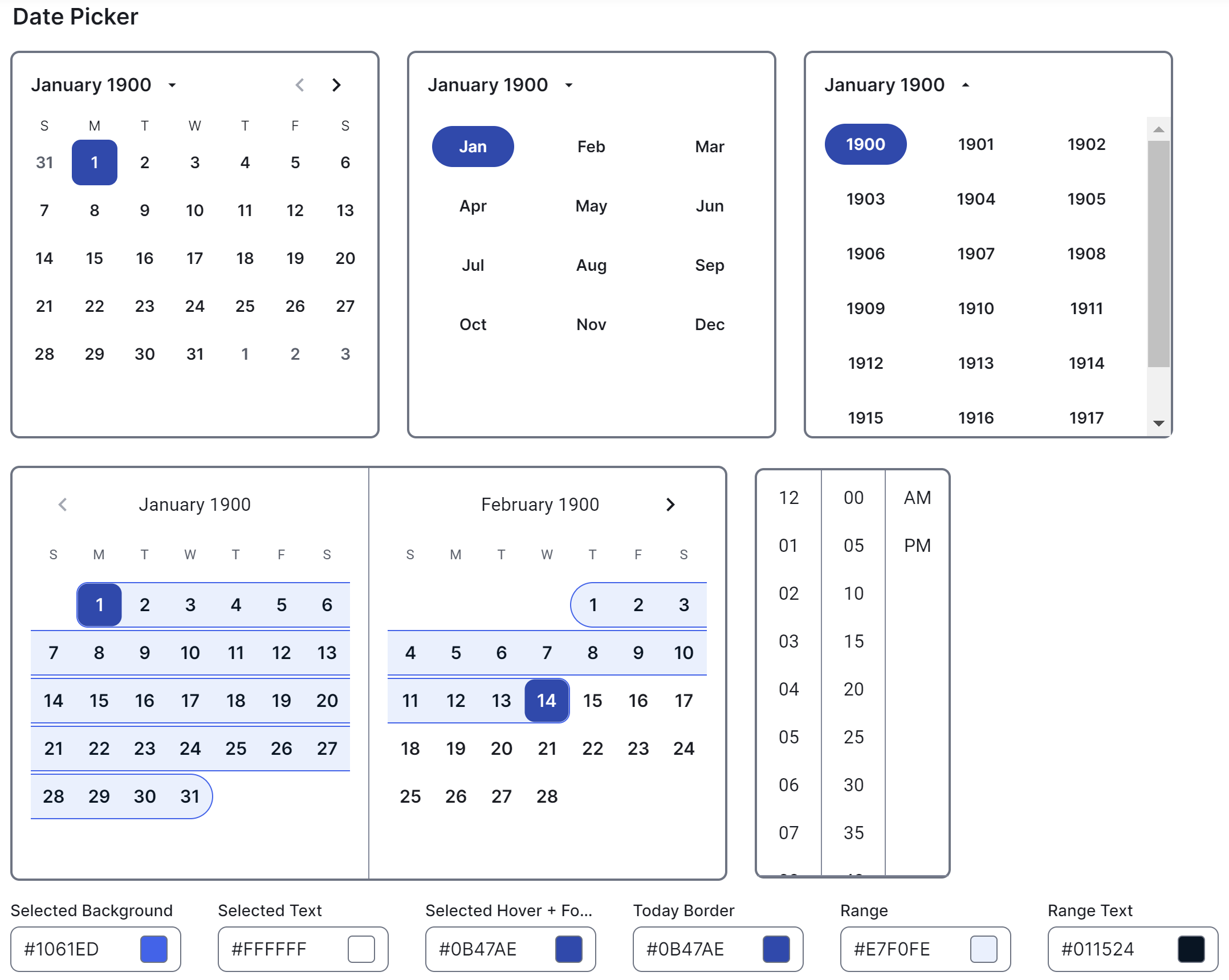
The Date Picker subsection enables you to select colors for the elements and different presentations of calendars.

The following table describes the fields in the Date Picker subsection.
| Field | Description |
|---|---|
| Selected Background | Background color of dates and time when selected in date pickers. |
| Selected Text |
Text color of years, months, dates, and time when selected in date pickers. |
| Selected Hover + Focus |
Background color of selected years, months, and dates when hovered over or in focus in date pickers. |
| Today Border | Border color of current dates in date pickers. |
| Range |
Background color of span of dates when selected in date pickers. |
| Range Text | Text color of dates within a range in date pickers. |