User interface terminology

Important  This feature is available only in the latest UI.

The Components section on the Custom Theme page contains terms related to the user interface (UI). The following table describes such terms and other UI-related terms used in Customize theme.

Term Description
Primary Button A prominent button for primary actions, designed to capture the user's attention.
Image of a primary button
Primary Button on Dark Background A primary button on a dark background.
Image of a primary button on a dark background
Secondary Button A button for secondary actions, complementing the primary button and often used for less critical functions. Secondary buttons include outline buttons, split buttons, and button groups.
Image of a secondary button
Secondary Button on Dark Background A secondary button when shown on a dark background.
Image of a secondary button on a dark background
Tabs A component for organizing and navigating between different sections.
Image of tabs
Tabs on Dark Background A tab on a dark background.
Image of tabs on a dark background
Brand Chip A component presented as a small, circular or rectangular-shaped chip for representing discrete pieces of information, for example, tags on asset pages, selected filters on the search page, or values in fields that accept multiple values.
Image of a brand chip
Switch A component for switching between the enabled state and the disabled state.
Image of a switch
Stepper A component for indicating progress through a sequence of logical steps.
Image of a stepper
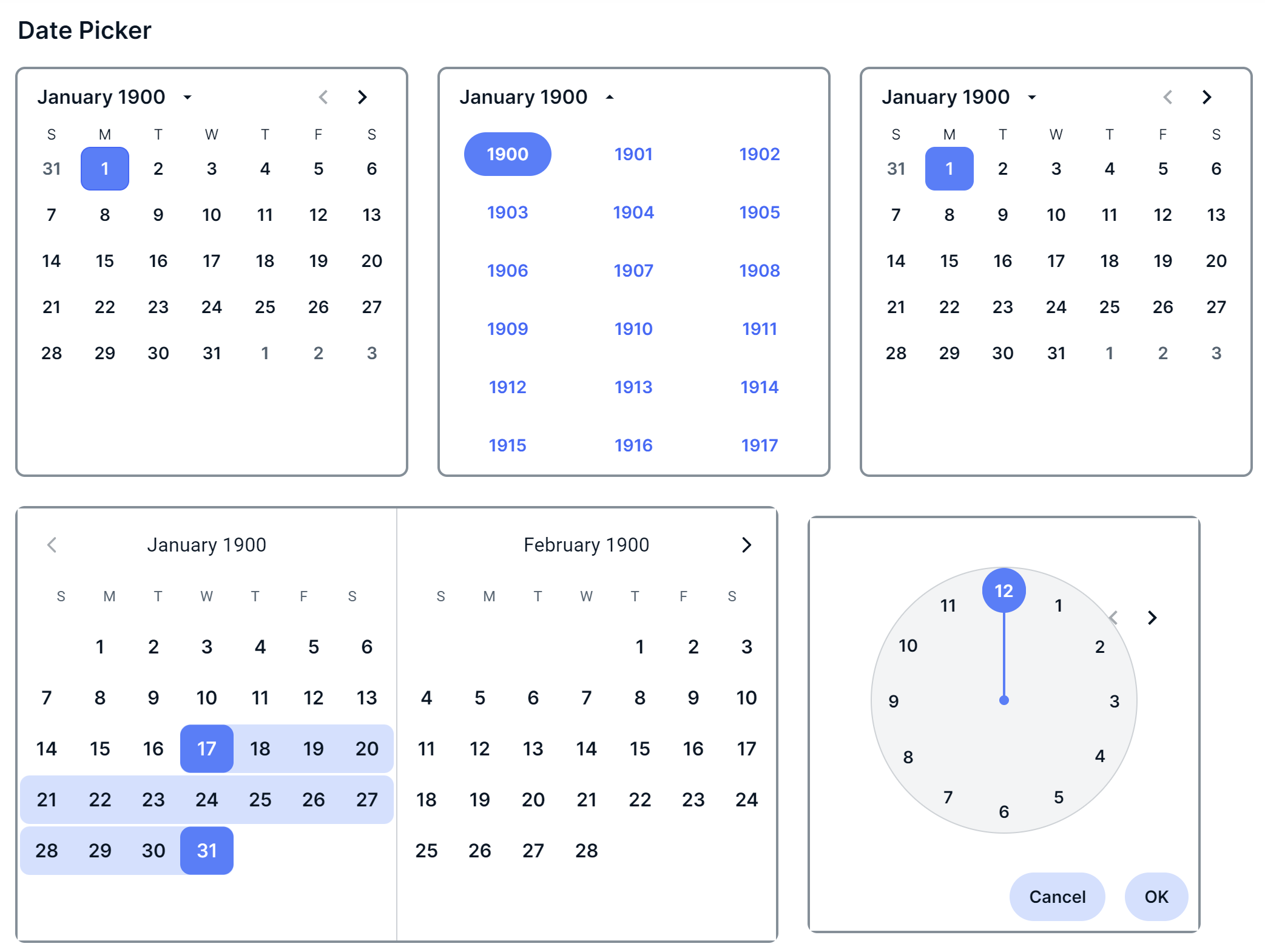
Date Picker A component for selecting a date and time from a calendar.
Image of date pickers