Note This topic is specific to the Usage Analytics dashboard that is available only in the previous, classic UI.
This topic describes the data that appears when you click a card in the Visits section.
Select the card whose data you want to understand:
Community
The Community card shows the five communities whose assets were visited the most in the current period. Depending on your permission, when you click the card, the Community subsection appears with the following tabs:
- Visits: The number of times that the users visited the assets by communities in the current period.
- Visitors: The number of users who visited the assets by communities in the current period.
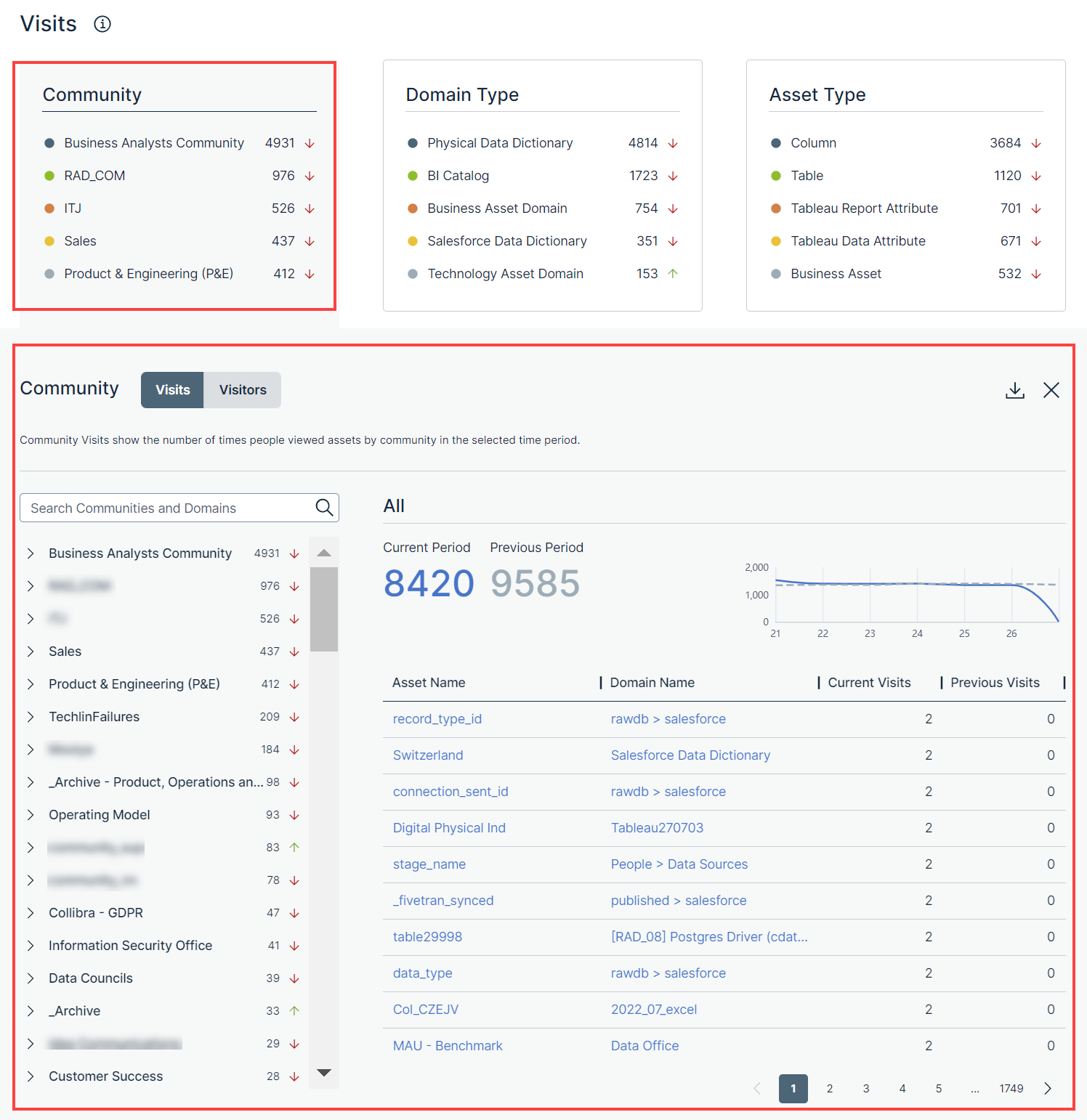
The left pane on the Visits or Visitors tab shows a list of all communities and domains in hierarchical order. You can search for a specific community or domain by using the Search Communities and Domains search box.
When you expand a community in the left pane, its subcommunities and domains are shown. In addition, the data for the community that you expanded is shown in the table next to the left pane. You can also expand a subcommunity or domain in the left pane to view the data for that subcommunity or domain in the table. You can identify the community or domain for which the data is shown in the table by the label above the table.
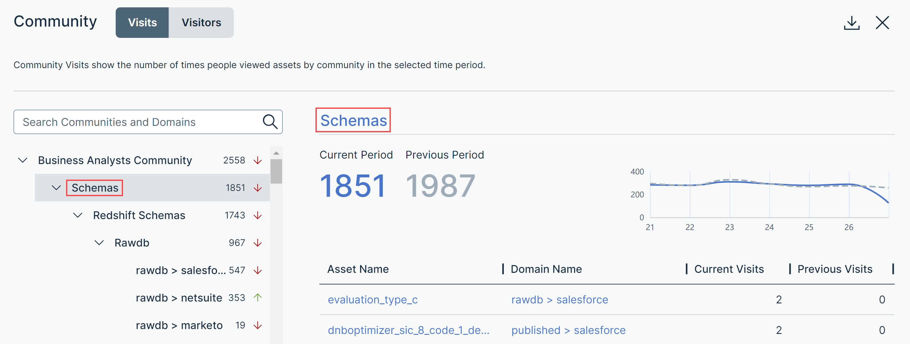
On the Visits tab, in the left pane, the number that appears next to each community or domain indicates how many times the users visited the assets within that community or domain in the current period. The arrow next to each number indicates the trend of the number of visits compared with the previous period.
- An up arrow indicates that the number of visits in the current period is more than that in the previous period.
- A down arrow indicates that the number of visits in the current period is less than that in the previous period.
- A left arrow indicates that the number of visits in the current period is the same as that in the previous period.
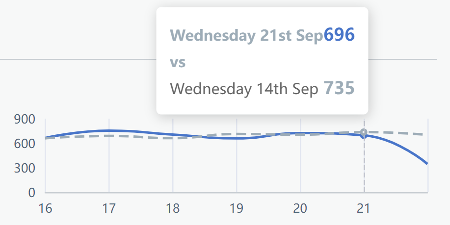
Above the table, Current Period shows the number of times that the users visited the assets within the selected community or domain in the current period, and Previous Period shows the corresponding number in the previous period. This data is also graphically represented as a trend line chart. You can hover your pointer over the solid (current period) or dotted (previous period) lines in the chart to compare the data between two corresponding days in the current and previous periods.
The table contains the following columns.
| Column | Description |
|---|---|
| Asset Name | The name of the asset that belongs to the selected community or domain. |
| Domain Name | The name of the domain to which the asset belongs. |
| Current Visits | The number of times that the asset was visited in the current period. |
| Previous Visits | The number of times that the asset was visited in the previous period. |
On the Visitors tab, in the left pane, the number that appears next to each community or domain indicates how many users visited the assets within that community or domain in the current period. The arrow next to each number indicates the trend of the number of visitors compared with the previous period.
- An up arrow indicates that the number of visitors in the current period is more than that in the previous period.
- A down arrow indicates that the number of visitors in the current period is less than that in the previous period.
- A left arrow indicates that the number of visitors in the current period is the same as that in the previous period.
Above the table, Current Period shows the number of users who visited the assets within the selected community or domain in the current period, and Previous Period shows the corresponding number in the previous period. This data is also graphically represented as a trend line chart. You can hover your pointer over the solid (current period) or dotted (previous period) lines in the chart to compare the data between two corresponding days in the current and previous periods.

The table contains the following columns.
| Column | Description |
|---|---|
| Asset Name | The name of the asset that belongs to the selected community or domain. |
| Domain Name | The name of the domain to which the asset belongs. |
| Current Visitors | The number of users who visited the asset in the current period. |
| Previous Visitors | The number of users who visited the asset in the previous period. |
Domain Type
The Domain Type card shows five domain types of the domains whose assets are visited the most in the current period. Depending on your permission, when you click the card, the Domain Type subsection appears with the following tabs:
- Visits: The number of times that the users visited the assets by domain types in the current period.
- Visitors: The number of users who visited the assets by domain types in the current period.
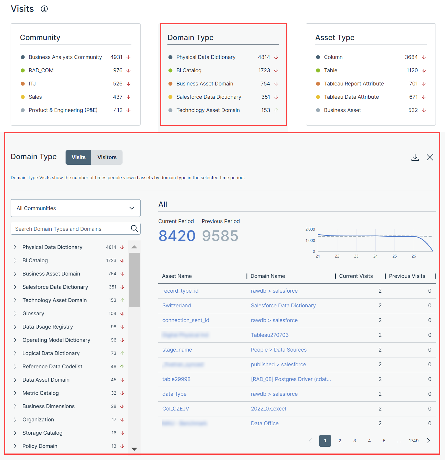
The left pane on the Visits or Visitors tab shows a list of domain types for all communities in a hierarchical order. Only the domain types that contain at least one domain are shown in the left pane. You can view the domain types for a specific community by selecting that community in the drop-down list box. You can search for a specific domain type or domain by using the Search Domain Types and Domains search box.
When you expand a domain type in the left pane, all the domains of that type are shown. In addition, the data for the domain type that you clicked is shown in the table next to the left pane. You can also click a domain in the left pane to view the data for that domain in the table. You can identify the domain type or domain for which the data is shown in the table by the label above the table.
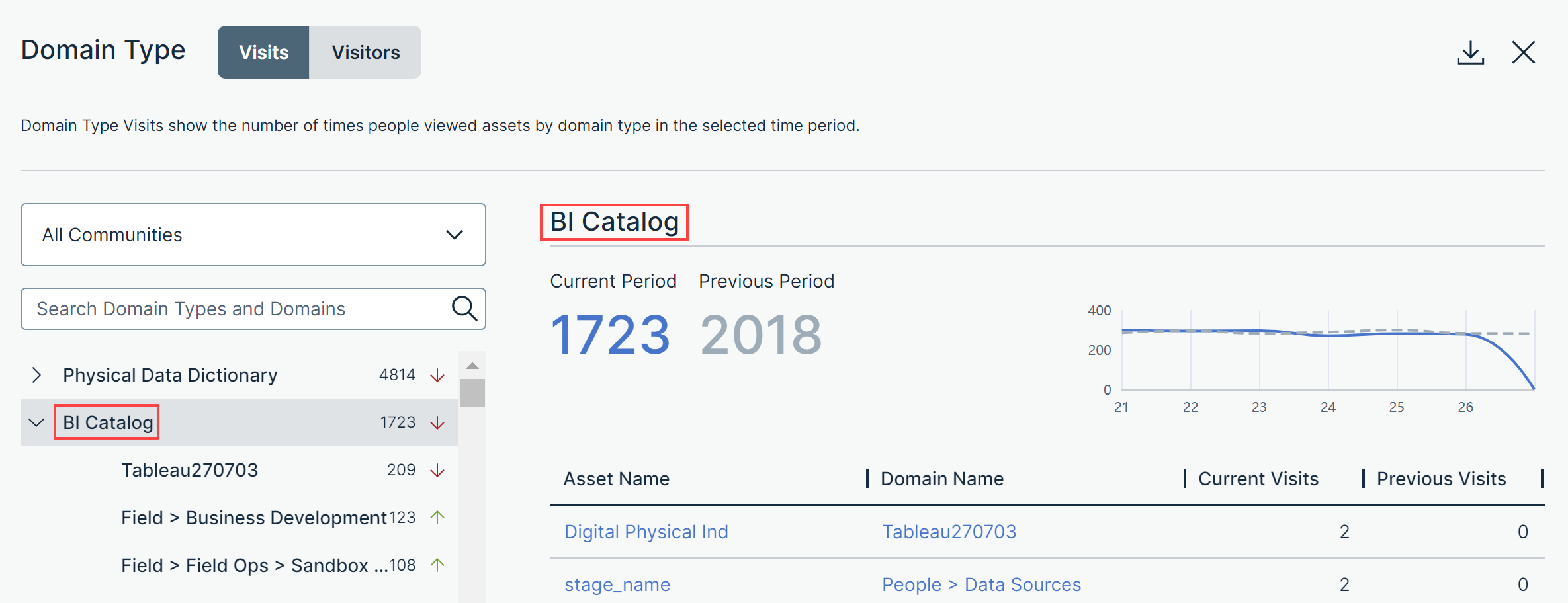
On the Visits tab, in the left pane, the number that appears next to each domain type or domain indicates how many times the users visited the assets within that domain type or domain in the current period. The arrow next to each number indicates the trend of the number of visits compared with the previous period.
- An up arrow indicates that the number of visits in the current period is more than that in the previous period.
- A down arrow indicates that the number of visits in the current period is less than that in the previous period.
- A left arrow indicates that the number of visits in the current period is the same as that in the previous period.
Above the table, Current Period shows the number of times that the users visited the assets within the selected domain type or domain in the current period, and Previous Period shows the corresponding number in the previous period. This data is also graphically represented as a trend line chart. You can hover your pointer over the solid (current period) or dotted (previous period) lines in the chart to compare the data between two corresponding days in the current and previous periods.
The table contains the following columns.
| Column | Description |
|---|---|
| Asset Name | The name of the asset that belongs to the selected domain type or domain. |
| Domain Name | The name of the domain to which the asset belongs. |
| Current Visits | The number of times that the asset was visited in the current period. |
| Previous Visits | The number of times that the asset was visited in the previous period. |
On the Visitors tab, in the left pane, the number that appears next to each domain type or domain indicates how many users visited the assets within that domain type or domain in the current period. The arrow next to each number indicates the trend of the number of visitors compared with the previous period.
- An up arrow indicates that the number of visitors in the current period is more than that in the previous period.
- A down arrow indicates that the number of visitors in the current period is less than that in the previous period.
- A left arrow indicates that the number of visitors in the current period is the same as that in the previous period.
Above the table, Current Period shows the number of users who visited the assets within the selected domain type or domain in the current period, and Previous Period shows the corresponding number in the previous period. This data is also graphically represented as a trend line chart. You can hover your pointer over the solid (current period) or dotted (previous period) lines in the chart to compare the data between two corresponding days in the current and previous periods.
The table contains the following columns.
| Column | Description |
|---|---|
| Asset Name | The name of the asset that belongs to the selected domain type or domain. |
| Domain Name | The name of the domain to which the asset belongs. |
| Current Visitors | The number of users who visited the asset in the current period. |
| Previous Visitors | The number of users who visited the asset in the previous period. |
Asset Type
The Asset Type card shows five asset types of the assets that are visited the most in the current period. Depending on your permission, when you click the card, the Asset Type subsection appears with the following tabs:
- Visits: The number of times that the users visited the assets by asset types in the current period.
- Visitors: The number of users who visited the assets by asset types in the current period.
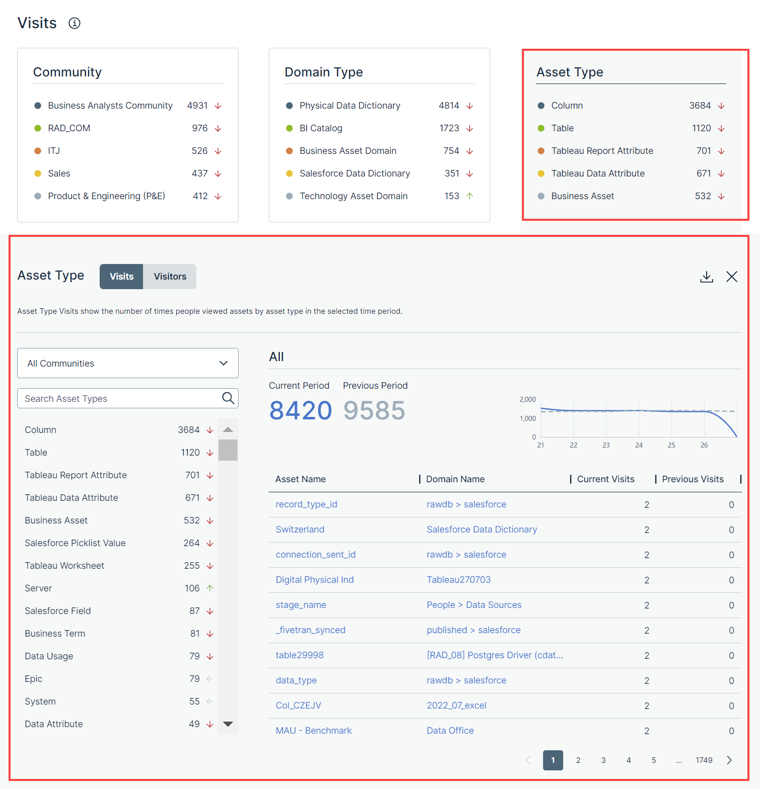
The left pane on the Visits or Visitors tab shows a list of asset types for all communities in hierarchical order. Only the asset types that contain at least one asset are shown in the left pane. You can view the asset types for a specific community by selecting that community in the drop-down list box. You can search for a specific asset type by using the Search Asset Types search box.
On the Visits tab, in the left pane, the number that appears next to each asset type indicates how many times the users visited the assets within that asset type in the current period. The arrow next to each number indicates the trend of the number of visits compared with the previous period.
- An up arrow indicates that the number of visits in the current period is more than that in the previous period.
- A down arrow indicates that the number of visits in the current period is less than that in the previous period.
- A left arrow indicates that the number of visits in the current period is the same as that in the previous period.
Above the table, Current Period shows the number of times that the users visited the assets within the selected asset type in the current period, and Previous Period shows the corresponding number in the previous period. This data is also graphically represented as a trend line chart. You can hover your pointer over the solid (current period) or dotted (previous period) lines in the chart to compare the data between two corresponding days in the current and previous periods.
The table contains the following columns.
| Column | Description |
|---|---|
| Asset Name | The name of the asset that belongs to the selected asset type. |
| Domain Name | The name of the domain to which the asset belongs. |
| Current Visits | The number of times that the asset was visited in the current period. |
| Previous Visits | The number of times that the asset was visited in the previous period. |
On the Visitors tab, in the left pane, the number that appears next to each asset type indicates how many users visited the assets within that asset type in the current period. The arrow next to each number indicates the trend of the number of visitors compared with the previous period.
- An up arrow indicates that the number of visitors in the current period is more than that in the previous period.
- A down arrow indicates that the number of visitors in the current period is less than that in the previous period.
- A left arrow indicates that the number of visitors in the current period is the same as that in the previous period.
Above the table, Current Period shows the number of users who visited the assets within the selected asset type in the current period, and Previous Period shows the corresponding number in the previous period. This data is also graphically represented as a trend line chart. You can hover your pointer over the solid (current period) or dotted (previous period) lines in the chart to compare the data between two corresponding days in the current and previous periods.
The table contains the following columns.
| Column | Description |
|---|---|
| Asset Name | The name of the asset that belongs to the selected asset type. |
| Domain Name | The name of the domain to which the asset belongs. |
| Current Visitors | The number of users who visited the asset in the current period. |
| Previous Visitors | The number of users who visited the asset in the previous period. |