Note This topic is specific to the Usage Analytics dashboard that is available only in the latest UI.
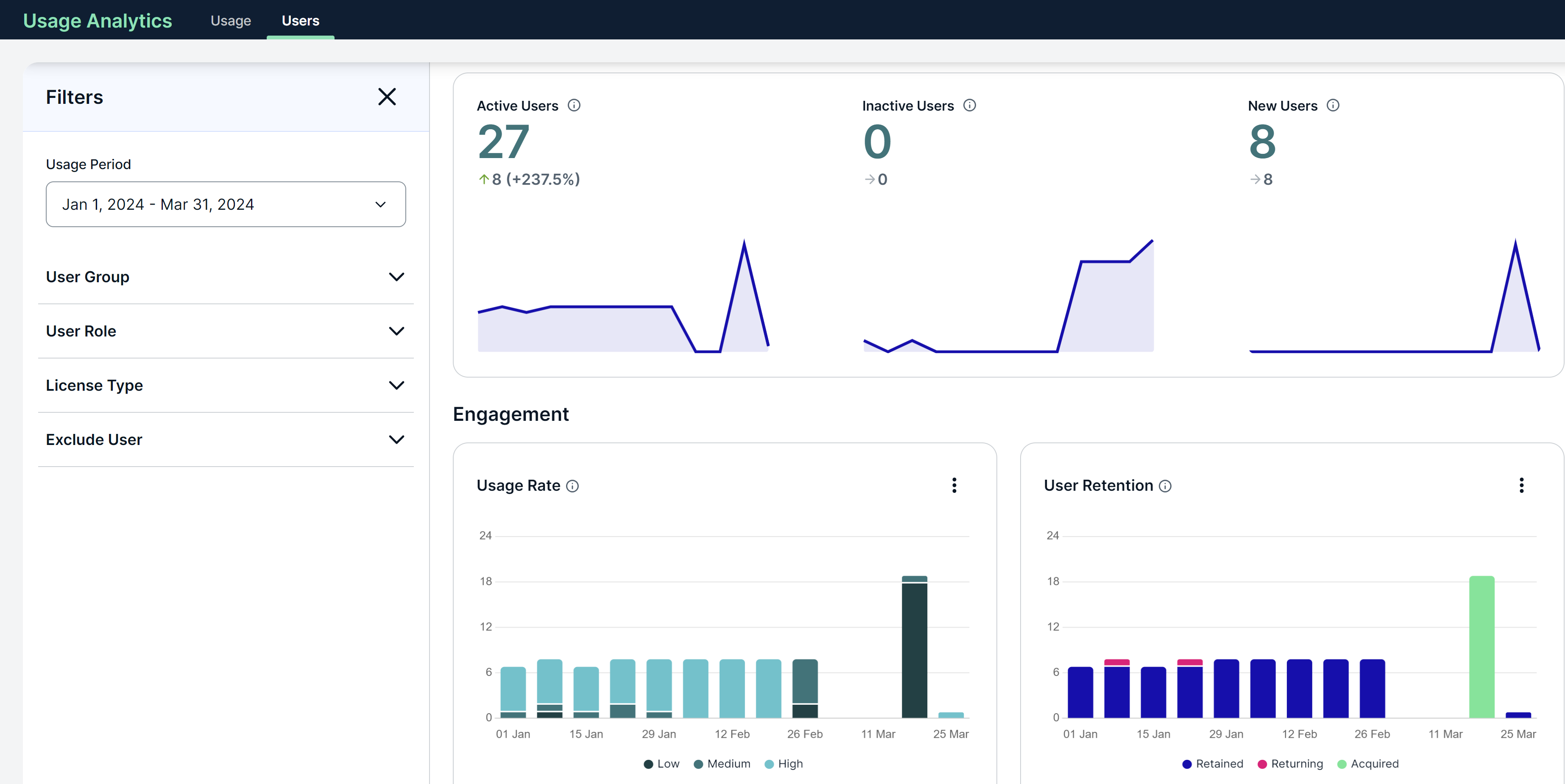
The Users tab on the Usage Analytics dashboard shows metrics related to
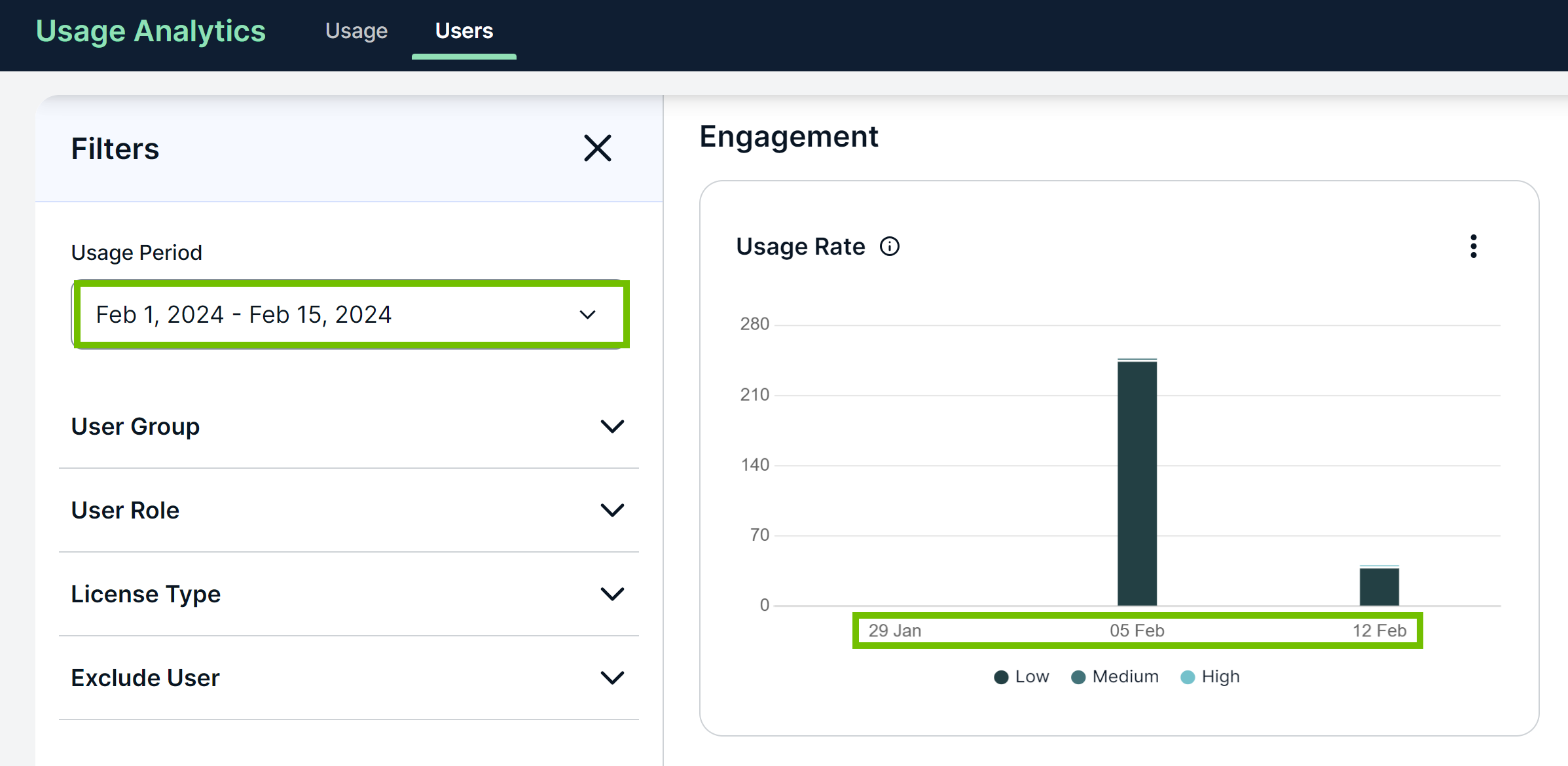
By default, the dashboard shows the metrics for the last 3 months. You can, however, select a different time period in the Usage Period field on the Filters pane, including your own period.
What the arrows indicate
The arrows in the top section of the dashboard indicate the trend in
- An up arrow indicates that the number in the current period is higher than that in the previous period by the number shown next to the arrow.
- A down arrow indicates that the number in the current period is lower than that in the previous period by the number shown next to the arrow.
- A right arrow indicates that the number in the current period is the same as that in the previous period.
How to explore metrics
You can explore the metrics on the Users tab through a variety of actions, which include the following:
- Filtering for a targeted analysis.
- Excluding categories from charts to focus on key data.
- Changing display mode for a different perspective.
- Downloading for offline use or sharing.
How to perform certain actions
The following table describes all the actions you can perform on the Users tab.
| Action | Description |
|---|---|
| Filter the metrics. | Use the Filters pane. |
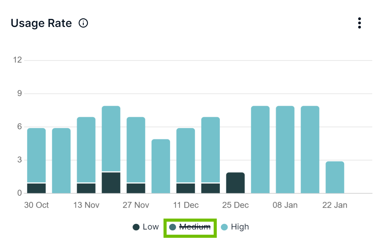
| Exclude a specific category from a chart. |
Click the legend representing the category. This shows the legend with a strikethrough. To include the category back, click the legend again.
|
| View a fuller version of the charts shown at the top of the dashboard in the |
Click anywhere on the charts in those sections. |
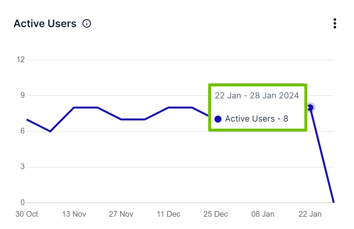
| View the information associated with a data point. | Hover your pointer over the data point.
|
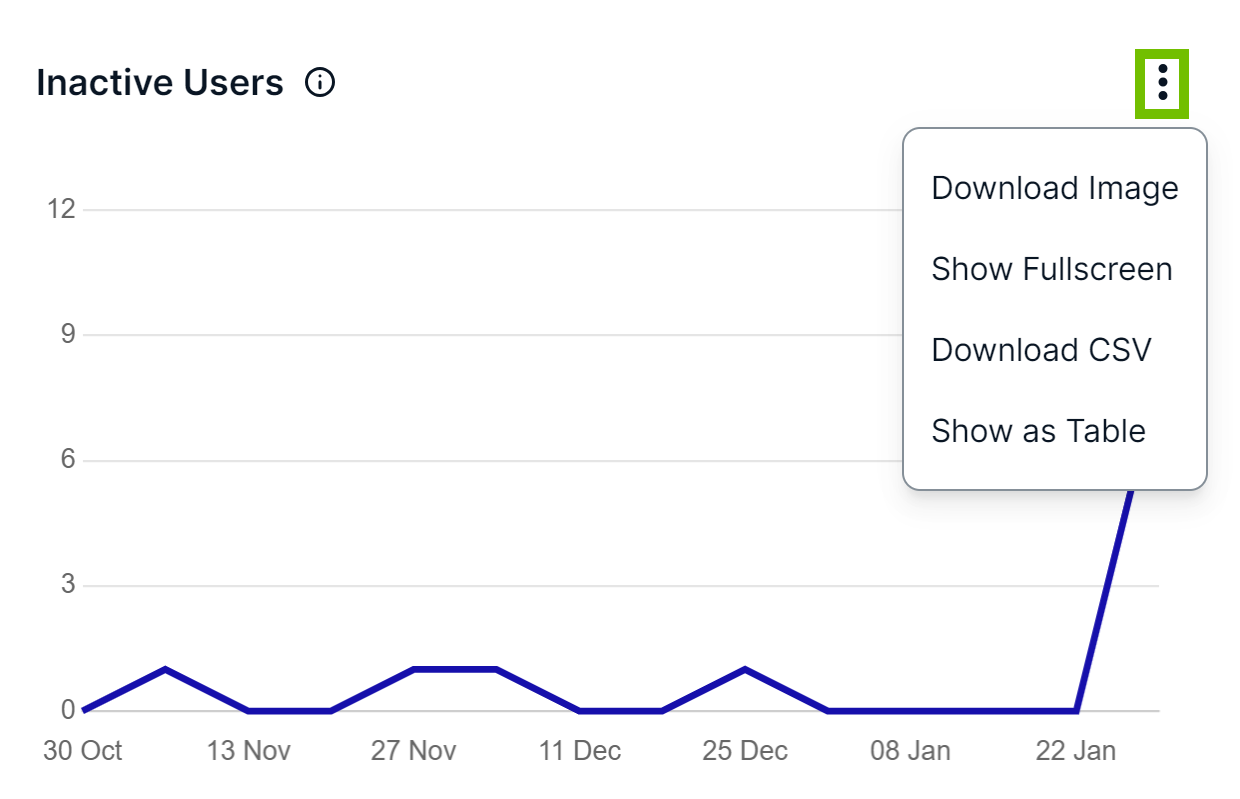
| View a chart in full screen. | Use
|
| View a chart as a table. | |
| Download a chart as an image. | |
| Download a chart as a CSV file. |
Start and end dates on the x-axis
