Profile provides a comprehensive analysis of the behavior of your dataset over time. When you run a DQ job, the results of the scan become available for analysis on the Findings and Profile pages. With rich options like the ability to drill down into column-level statistics, create quick rules, and evaluate charts and graphs that show common and emergent trends in your data, you can obtain a granular understanding of the contours of your dataset.
Collibra DQ automatically profiles datasets over time to allow you to drill down into its columns for detailed insights and automated data quality. The creation of a dataset profile is just the first step towards an amazing amount of auto-discovery. Visualize segments of the dataset and how the dataset changes over time.
When you create a job from Explorer, the options on the AdaptiveRules tab of the Add Layers step help to generate a complete profile. While many of the options are enabled by default, you may need to enable additional options, such as Min, Mean, and Max, to refine the profile of your dataset to fit your needs.
Tip Many of the graphs and charts on the Profile page have additional insights when you hover your cursor over them.
Dataset profile graph
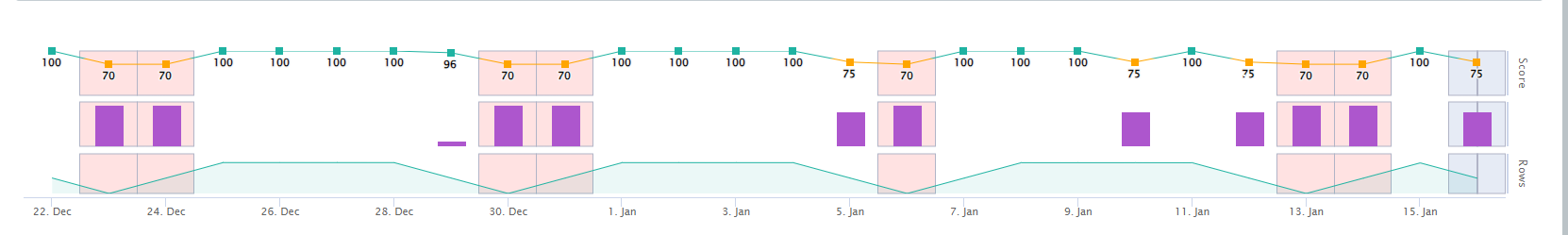
The dataset profile graph shows dataset run details, including score, observation type, and row count changes. This is similar to the graph at the top of a dataset's Findings page, where you can hover your cursor over the various graph elements to reveal additional details, such as the number of points deducted per observation type. Additionally, you can click the score entry on the line graph to open the dataset profile of that day's run.
Dataset profile table
The dataset profile table contains a variety of insights about column-level data quality metrics. These automatic insights bring together numerous different statistics based on the results of your DQ Job to reveal the baseline complexion of your dataset. The profile can discover attributes that help to delineate between the relative metrics around numeric versus non-numeric data.
Tip You can click anywhere in a row on the Profile page to expand it and view additional column-level insights.
| Column | Description | |||||||||||||||
|---|---|---|---|---|---|---|---|---|---|---|---|---|---|---|---|---|
| Column | The column of your dataset whose insights the row contains. | |||||||||||||||
| Sensitive |
View, add, or edit the sensitive label of a column. When a column has a sensitive label, a green chip with the name of the sensitive label displays. If a column does not have a sensitive label, a Go to the Adding Sensitive and Data Class labels section to learn how to add sensitive labels. Tip Admin users can manage sensitive labels on the Sensitive Labels Management page of the Admin Console. |
|||||||||||||||
| Data Class |
View, add, or edit the data class of a column. When a column has a data class, a green chip with the name of the data class displays. If a column does not have a data class, a clickable + displays in the column. Go to the Adding Sensitive and Data Class labels section to learn how to add data classes. Tip You can manage data classes on the Data Classes page. |
|||||||||||||||
| Profile |
Baseline (B) is the historical profile of a dataset, which is the mean value of past lookback runs. For example, the mean number of NULLs in column x for the past 10 runs. The baseline is determined by the data lookback period, which you can configure in the settings when creating or editing a DQ Job. While the default lookback is 10 runs, you can set it to anywhere between 3 and 20 runs. The sliding lookback window establishes guardrails for the baseline as the DQ Job runs along a schedule. To reset the baseline, you need to create a new DQ Job. You cannot reset the baseline of an active DQ Job because it would reduce the value of the profile insights from previous days, as there is not a way to identify when the baseline was reset. Note Some runs are excluded from the baseline based on annotations. For example, adaptive rules marked as "breaking" are excluded from the baseline or "normal" values. |
|||||||||||||||
| Run (R) is the profile of the current run of a dataset. | ||||||||||||||||
| Defined Type | The data type of a column when the dataset was created. | |||||||||||||||
| Inferred Type | The data type(s) of a column that Collibra DQ learns are possible deviations from the defined type. If a column does not contain a potential deviation, then the data type matches the defined type. | |||||||||||||||
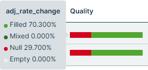
| Completeness/Consistency |
Hover your cursor over the chart to see a percentage breakdown of the field values of the rows in a column. The represented field values are Filled, Mixed, Null, and Empty, which reflect the baseline profile data, not the current run.
|
|||||||||||||||
| Unique | The unique distribution, also known as cardinality, in a column. This can be an important part of understanding if the values in a column continues to be unique, or if it contains the same values. For example, the expectation of an "ID" column might be that all values should be unique, whereas the expectation of a "date" column might be that all values should be the same. | |||||||||||||||
| B is the number of unique values in the baseline profile of a column. | ||||||||||||||||
| R is the number of unique distributions in the profile of a column from the current run. | ||||||||||||||||
| % is the percentage the baseline and run values deviate from each other. | ||||||||||||||||
| Null | The percentage of data that has no value at all. | |||||||||||||||
| B is the percentage of null values in the baseline profile of a column. | ||||||||||||||||
| R is the percentage of null values in the profile of a column from the current run. | ||||||||||||||||
| % is the percentage the baseline and run values deviate from each other. | ||||||||||||||||
| Empty |
The percentage of data that has a string instance of zero length. |
|||||||||||||||
| B is the percentage of empty values in the baseline profile of a column. | ||||||||||||||||
| R is the percentage of empty values in the profile of a column from the current run. | ||||||||||||||||
| % is the percentage the baseline and run values deviate from each other. | ||||||||||||||||
| Mixed | The percentage of data that Collibra DQ observes as non-numeric (or numeric) in a numeric (or non-numeric) column. | |||||||||||||||
| B is the percentage of mixed values in the baseline profile of a column. | ||||||||||||||||
| R is the percentage of mixed values in the profile of a column from the current run. | ||||||||||||||||
| % is the percentage the baseline and run values deviate from each other. |
Column insights
Column insights become visible when you drill down into a column. These insights for baseline and current runs include key statistical data points, data visualization tools, and overviews of Adaptive Rules and Rules. Click the expand icon to the right of the column name to drill down into the column and reveal insights.
Column-level statistics
When data is available, a drill down into a column reveals four sections on the left:
- The Stats section shows high-level statistics for current run data, including:
- Min value
- Q1 (displays "N/A" when the data type is string or a date)
- Median value (displays "N/A" when the data type is string or a date)
- Mean value
- Q3 (displays "N/A" when the data type is string or a date)
- Max Value
- Min string length (only displays when the data type is string)
- Max string length (only displays when the data type is string)
- Min precision (only displays when the data type is double, float, or decimal)
- Max precision (only displays when the data type is double, float, or decimal)
- Min Scale (only displays when the data type is double, float, or decimal)
- Max Scale (only displays when the data type is double, float, or decimal)
- The Distribution section shows the number of unique values for current run data.
- The Completeness section shows the following donut charts for baseline run data:
- Null percentage
- Empty percentage
- Mixed data type percentage
- The Business Term section shows the name of the business term and its description.
- You can click the
 to the right to apply a business term to your column or edit an existing one.
- You can click the
Column-level data visualization
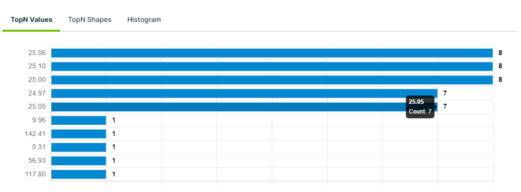
The TopN Values tab shows the cell values that appeared the most and least frequently in the column of reference for the current run. This can help you understand the data distribution within a column, identify the top- and lowest-performing data, and spot trends or patterns. In the example above, the most frequently observed values are 25.06, 25.10, and 25.00, all of which were counted 8 times. The least frequent observed values are 9.96, 142.41, 5.31, 56.93, and 117.80. You can hover your cursor over a bar on the chart to see the exact value and its count.
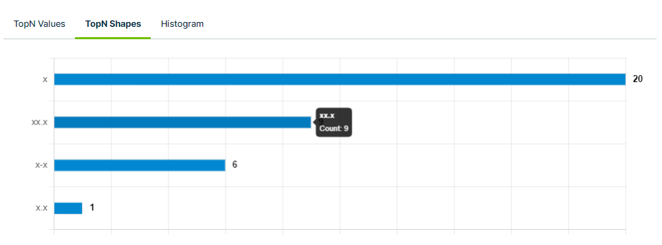
The TopN Shapes tab shows the string data type cell values that appeared the most and least frequently in the column of reference for the current run. This can help you identify inconsistent data types or unexpected string values, recognize frequently recurring patterns, and understand the distribution of data in the column. In the example above, the most frequently observed shape value is "x," which was counted 20 times. The least frequently observed shape value is "x.x," which was counted only once. You can hover your cursor over a bar on the chart to see the exact shape value and its count.
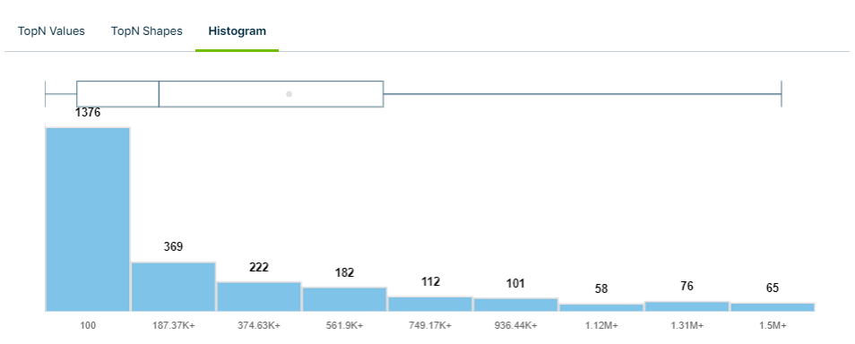
The Histogram tab shows a graphical representation of the distribution of data within a column for the current run. This provides insights into important data points, including:
- Minimum value
- Lower and upper quartiles
- Median
- Mean
- Maximum value
Hover your cursor over the box and whisker plot to see the above data points, or hover over an individual bar to see the values it represents.
Column-level rules
| Column | Description |
|---|---|
| Field | The column or data quality metric represented in the row. |
| Check | The type of AdaptiveRule that uses to check for common data quality issues. |
| Condition | The SQL expression related to the Check that Collibra DQ's machine learning model automatically applies to the column or metric based on what it identifies as normal. |
| Status |
 indicates that the values in the column do not contradict the condition of the AdaptiveRule. indicates that the values in the column do not contradict the condition of the AdaptiveRule. |
 indicates that the values in the column contradict the condition of the AdaptiveRule. indicates that the values in the column contradict the condition of the AdaptiveRule. |
|
 indicates that any findings from the AdaptiveRule are ignored. indicates that any findings from the AdaptiveRule are ignored. |
|

|
Shows the data point of a given column relative to its baseline. In the example to the left, the red line represents the data point of the value for the current run, overlaid atop the baseline and expected range of that run. When a column has a value well outside the expected range boundary, it triggers a "Breaking" status for that type of check. This range also appears on the Findings page for the breaking column. |
| Action | Click  to open the Change Detection modal. to open the Change Detection modal. |
Shows when a user-generated rule is applied to a column.
| Column | Description |
|---|---|
| Rule Name | The name of your column-level rule. |
| Value | The condition of your column-level rule. |
| Valid |
Shows whether a rule passes validation.
|
| Repo |
The data class or template from which a rule is created. This only applies to custom rules, such as Data Type, Data Class, and Template. |
| Category |
The data category that you optionally define on the Workbench. |
| Dimension |
The DQ Dimension that you optionally assign to your rule on the Workbench. |
| Status |
Shows whether your rule is active for future runs of the dataset. Click the switch to change the active status of your rule. |
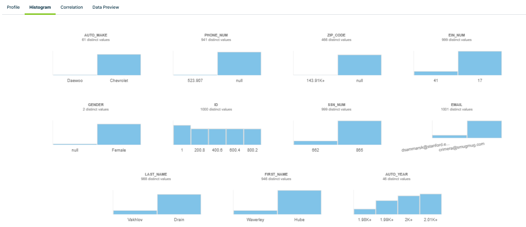
The Histogram tab provides a visual overview of all of the columns in your dataset where histogram data is available. From this tab, you can see the number of distinct values that a column contains, as well as the frequency when you hover your cursor over a histogram bar.
The histograms are calculated using the number of buckets. For example, numeric type buckets can be calculated based on the difference between Q1 and Q3 values. The number of buckets are then used in a WIDTH_BUCKET Snowflake function, which defines the number of bars and creates the histogram.
The number of bars vary. For example, string types can show 2 bars (1 for min count and 1 for max count) or only 1 bar if the min and max counts are identical.
For example, the following queries for DQ_String return the same results and would only show as one bar in the histogram:
-
SELECT 'DQ_STRING' AS column_name, "DQ_STRING" AS minimum_string, COUNT(1) AS minimum_count FROM (select * from PUBLIC.TEST_16744) GROUP BY column_name, minimum_string ORDER BY minimum_count ASC LIMIT 1 -
SELECT 'DQ_STRING' AS column_name, "DQ_STRING" AS maximum_string, COUNT(1) AS maximum_count FROM (select * from PUBLIC.TEST_16744) GROUP BY column_name, maximum_string ORDER BY maximum_count DESC LIMIT 1
- The histograms are only generated for numeric and string types, not for date/timestamp types.
- Values outside of the upper and lower bound ranges are not included in the histograms. Specifically, values that are less than the lower bound and greater than or equal to the upper bound.
- If you use a
selectstatement with columns that have delimited identifiers (non-regular identifiers), you must surround the column names with backticks in the query.
Correlation
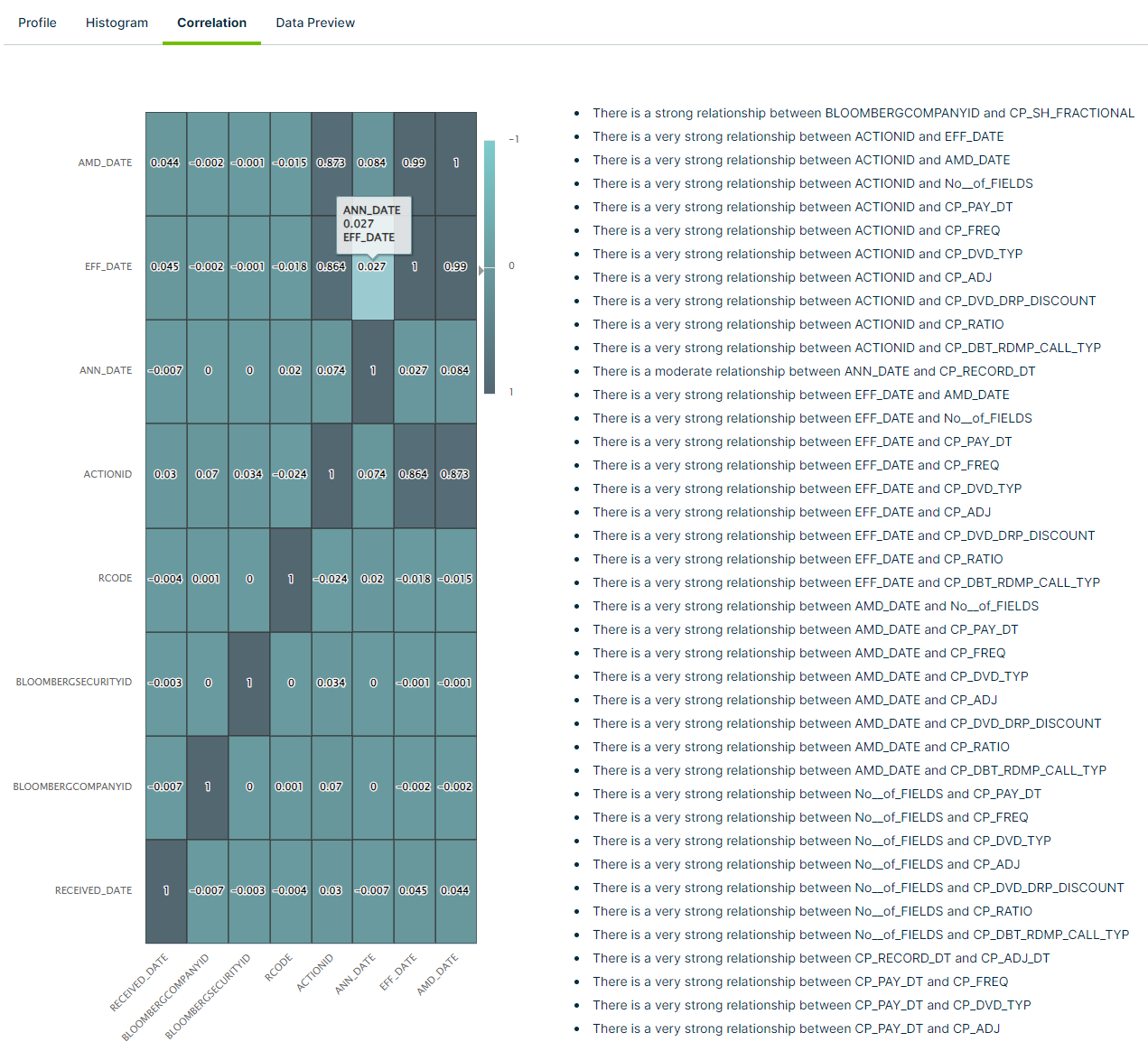
The correlation tab shows a graphical matrix of the correlation coefficient between two or more columns in your dataset. This can help you discover hidden column relationships in your dataset and measure their strength. Using just a few examples from the above screenshot, Collibra DQ observed the following relationships:
- There is a very strong relationship between the columns "ACTIONID" and "EFF_DATE"
- There is a strong relationship between the columns "BLOOMBERGCOMPANYID" and "CP_SH_FRACTIONAL"
- There is a moderate relationship between the columns "ANN_DATE" and "CP_RECORD_DT"
You can hover your cursor over any cell to see the correlation details between the two columns.
- Larger datasets with many relationships between columns might not display all columns in your dataset on the matrix. However, relationships between non-visible columns will still display in the list on the right side of the matrix, when applicable.
- The matrix displays a maximum of 10 columns, regardless of the number of columns returned from the API response.
Data Preview
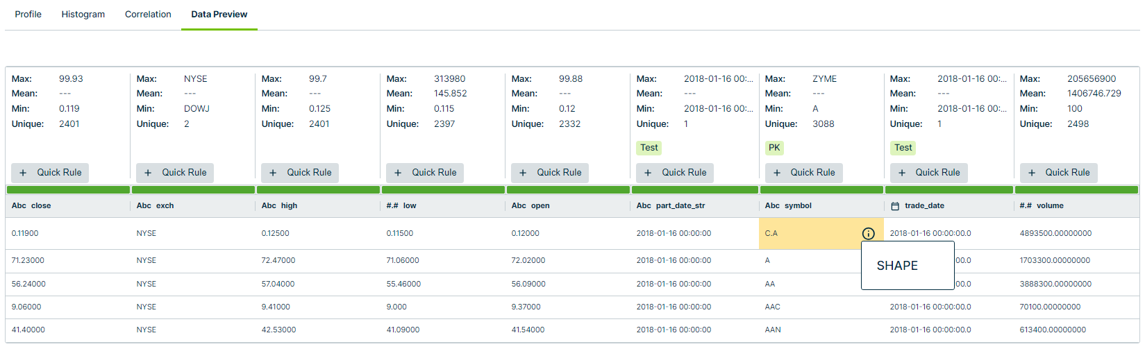
The Data Preview tab shows a preview of the data in the columns in your dataset. This gives you insights into high-level statistics, such as:
- Maximum value in the column
- Mean value
- Minimum value
- Number of unique values
- Columns with labels or designations, such as Sensitive Labels and Parent Keys
You can also see columns where Collibra DQ discovered specific detections, such as the Shape observation in the "symbol" column in the example above. Additionally, you can click + Quick Rule and select either a Data Type, Data Class, or Template rule from the dropdown menu to automatically apply it to your dataset. You can then find the quick rule on the Dataset Rules page of your dataset.