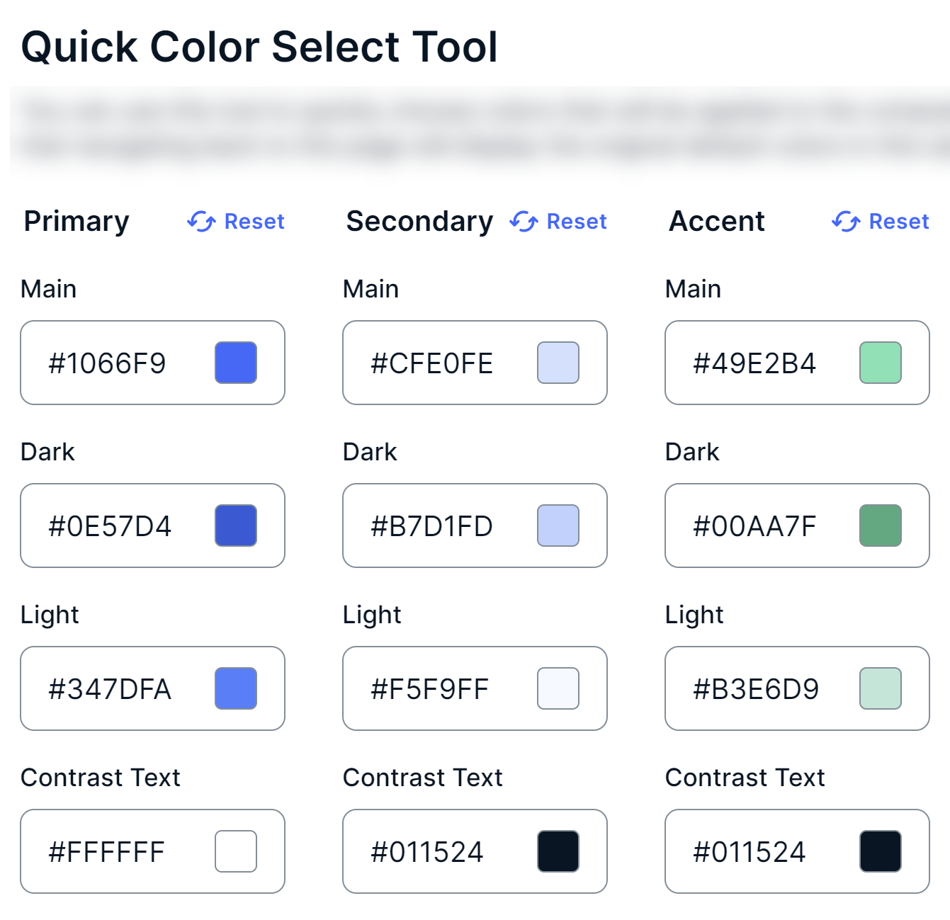
You can change the colors of the components in your environment via the Quick Color Select Tool section on the Custom Theme page.
The Quick Color Select Tool and Components sections affect the same components. However, the Quick Color Select Tool section offers a quick way to set colors for components, whereas the Components section allows for color selection at a more granular level for the same components. For example, in the Components section, you can also select a color for subcomponents, such as the active state for tabs or the background color for enabled switches.
- This topic contains certain terms related to the user interface. For information about these terms, go to User interface terminology.
- To undo all your changes in a subsection, click Reset in the subsection.
- The colors you select in the Components section always take precedence over the colors selected in the Quick Color Select Tool section.
- The colors you select in the Quick Color Select Tool section are not retained in the section, even if you click Save Customizations. Those colors are, however, applied to the components, after you click Save Customizations.
- When you change the colors in the Quick Color Select Tool section, your changes are reflected in the Components section for the applicable components. However, when you change the colors in the Components section, your changes are not reflected in the Quick Color Select Tool section.

The following table describes the subsections and the fields in the Quick Color Select Tool section.
| Subsection | Description |
|---|---|
| Primary | Colors of primary buttons and certain states of switches, steppers, and date pickers. |
|
Main
|
|
|
Dark
|
Background color of primary buttons when being clicked, to indicate that your interaction with the button is registered. |
|
Light
|
|
|
Contrast Text
|
|
| Secondary | Colors of secondary buttons and certain states of date pickers. |
|
Main
|
|
|
Dark
|
Background color of secondary buttons when being clicked, to indicate that your interaction with the button is registered. |
|
Contrast Text
|
|