Customize notebook chart
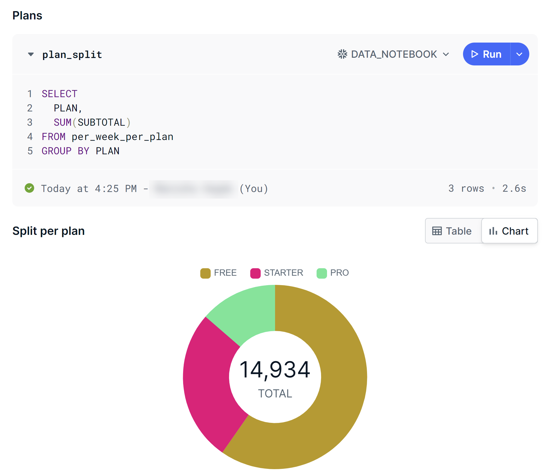
After running a query in a notebook, you can view the query results as a chart instead of a table by clicking Chart. You can also customize the chart by clicking Edit chart, which appears when you hover your pointer over the chart.

The following table describes some of the options available for customizing the chart.
| Option | Description |
|---|---|
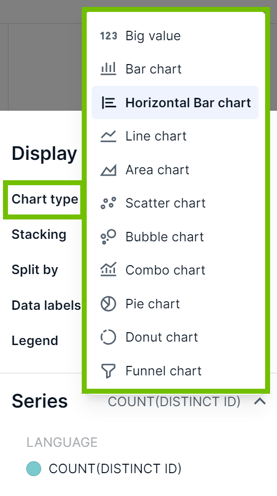
| Change the type of chart. | Use the Chart type field. |
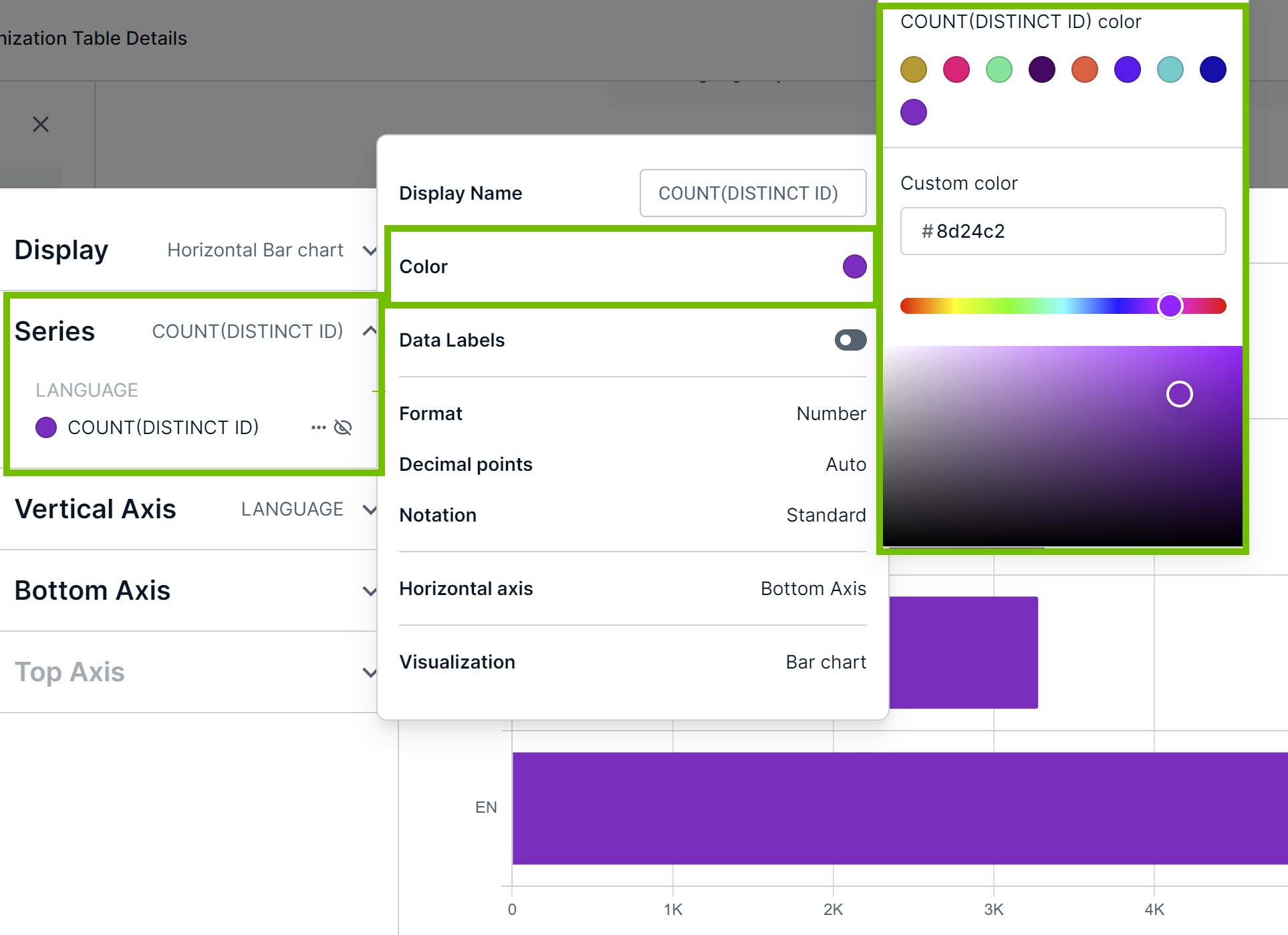
| Change the chart colors. | Use the Series section. |
|
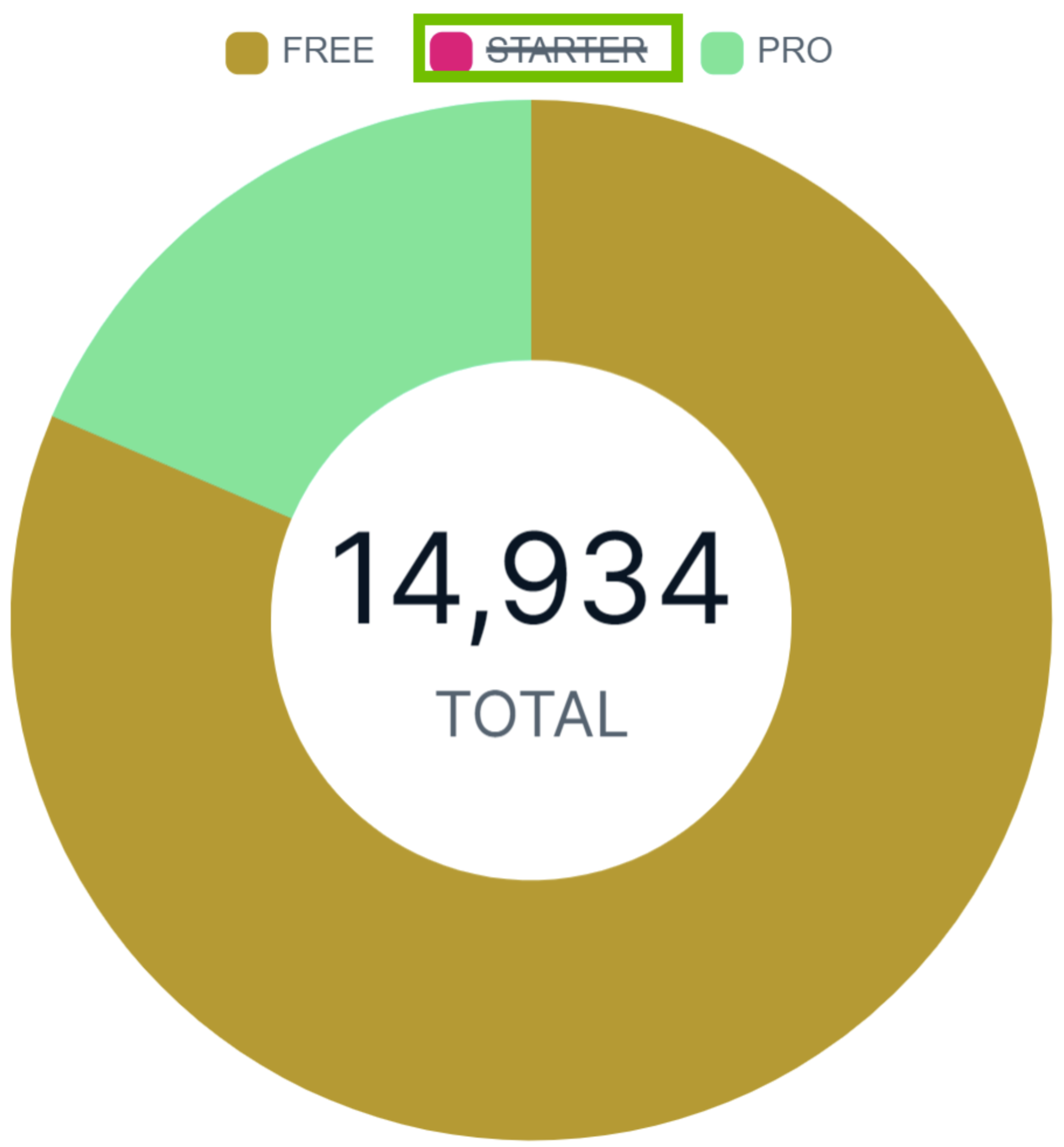
Exclude a specific category from the chart. Tip This option is available only in certain types of charts, such as donut and pie charts.
|
Click the legend representing the category. |