The data profiling process provides a view on the registered data by means of frequency charts and distribution charts.
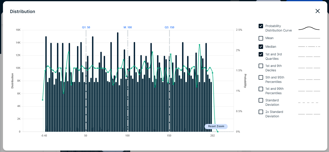
- In some charts, you can zoom in by selecting the area of your preference. Click the Reset Zoom button to return to the original chart view.
- The charts use the abbreviations K for thousand and M for million.
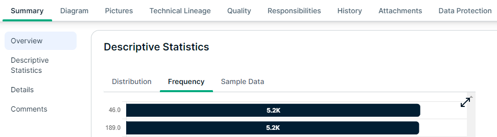
- In Column assets, the charts are visible in the Summary tab, in the Descriptive Statistics section.
- From Table assets, you can open the charts for a column in a dialog box. You can do this in the following ways:
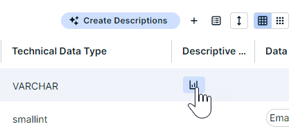
- In the Summary tab, in the Columns section, click the chart icon in the Descriptive Statistics column.
- In the Sample Data tab, click the chart icon located next to the column name.
- In the Summary tab, in the Columns section, click the chart icon in the Descriptive Statistics column.
Frequency chart
A frequency chart, or bar chart, displays the most and least frequent values of a column along with their number of occurrences. It shows how many times a value is present in the column.
A frequency chart is available only if Categorical Data = true.
If available, this chart is shown in the Frequency tab of the Descriptive Statistics.
Distribution chart
The data distribution chart, or histogram, displays how data is distributed.
A distribution chart is available only if the data type is Whole Number or Decimal Number.
If available, this chart is shown in the Distribution tab of the Descriptive Statistics.
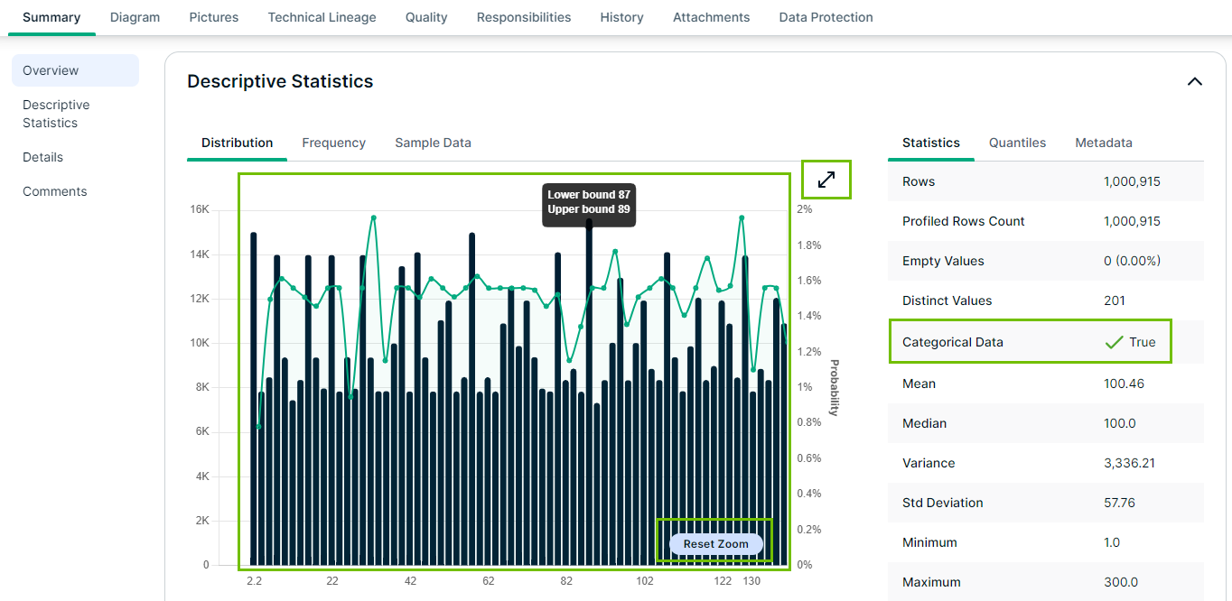
In this chart, you can receive extra information such as the mean, standard deviation and so on, by clicking the Expand icon and selecting the options at the right of the chart.![]()
For information on other profiling results, go to Data profiling information.