Monitoring data quality in assets
Business Analysts, Data Product Managers, and Governance Managers use the Quality tab to monitor the health of assets. The Quality tab shows a list of monitors and jobs for the asset, the overall data quality score and its history, as well as data quality score ring charts for each data quality dimension. This helps you confirm the data is trustworthy. You can then confidently use it in your reports and decision-making processes.
In this topic, you will learn:
- Why the Quality tab is a necessary tool for assessing the health of assets.
- How to interpret the quality scores.
- A use case for the Quality tab.
The Quality tab: the health dashboard of your assets
The Quality tab is the primary source for data quality insights on asset pages. It shows:
- A score history chart showing the evolution of the data quality score of the asset.
- The aggregated score of the asset.
- The aggregated scores of individual dimensions linked to the asset.
The values on the Quality tab come from aggregated asset data. This aggregation relies on the chain of relations defined in quality score aggregations. Admins can configure these on the Quality score aggregations tab of the Operating model page.
The Quality tab contains two sections: Collibra Data Quality and External Data Quality. This allows Collibra to capture the source of your data quality scores and organize them appropriately.
These sections show different information depending on the source tool from which your data quality scores originate. The source tool can be Collibra Data Quality & Observability, a third-party data quality tool, or both.
- Collibra Data Quality: This section shows data quality insights from Collibra Data Quality & Observability.
- External Data Quality: This section shows data quality insights from third-party data quality tools, including Collibra Data Quality & Observability Classic.
Regardless of the tool you use, a data quality health dashboard is available when an asset has active data quality monitors. This dashboard shows a score history chart, quality overview table, and quality score ring charts for the asset and its monitors. This dashboard gives you a high-level view of the health of your data. It also provides an entry point for further investigating any data quality issues that may arise.
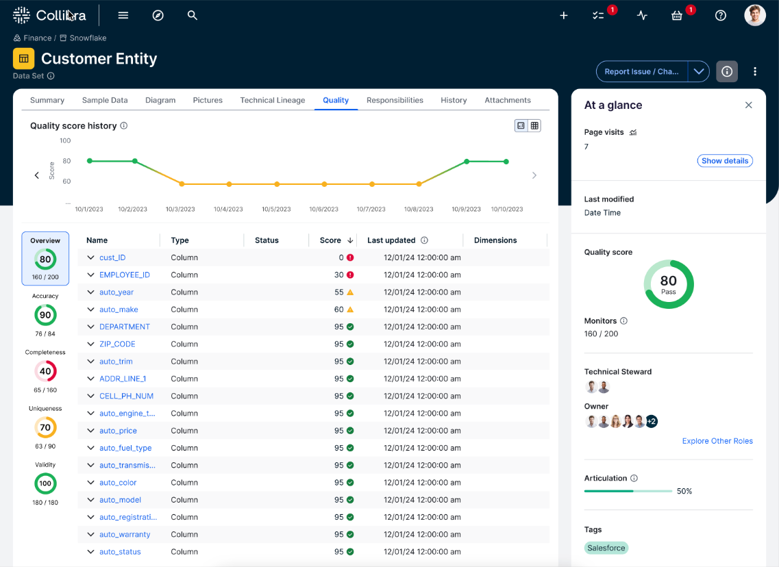
Quality score history chart
The quality score history chart shows the historical data quality scores of the asset. Each point on the chart represents the quality score on a given date. The information in the chart varies depending on the data quality score source. It shows a daily, weekly, or monthly aggregated score for Collibra Data Quality and for external data quality tools. This helps you track changes and trends to data accuracy, consistency, and completeness. You can also view this as a list.
Quality score tiles
Quality score tiles display ring charts for the asset overview or specific dimensions. Each tile shows:
- The score (out of 100).
- The status color.
- The number of passing monitors.
When you open the Quality tab, the Overview tile and all monitors are shown. When you click a dimension tile, the quality overview table shows its related monitors.
Quality overview table
The table shows the following information:
- Name: The name of the schema, table, column, or job. When you click the name of a job, you are directed to the Monitors tab of the Job Details page, with the monitor actions drawer for the selected monitor open.
- Type: The database object or monitor type.
- State: The state of the monitor, including Breaking, Passing, Learning, and Suppressed.
- Score: The data quality score aggregated, as an average of the quality scores of the underlying schema, table, or column assets.
- Last updated: The date and time of the last run in MM/DD/YYYY, hh:mm:ss AM/PM format.
- Dimensions: The data quality dimensions associated with a monitor.
Interpreting quality scores
The Quality tab presents scores using ring charts. These charts represent aggregated data quality scores for the overall score and out-of-the-box and custom data quality dimensions, which can indicate the health of your data.
The following colors indicate the quality status:
| Color | Range | Status | Description |
|---|---|---|---|
| Green | 85-100% | Passing | The score is above the passing threshold. |
| Orange | 50-85% | Warning | The score is below the acceptance threshold but above the warning threshold. |
| Red | 0-50% | Failing | The score is below the warning threshold. |
Use case: Enforcing data contracts with quality insights
Consider a scenario where a Governance Manager at a global financial institution requires that the "Customer_Transactions" Column asset adheres to a specific data contract. The Service Level Agreement (SLA) for this contract requires that the data must maintain a global quality score above 90% to be considered fit for use in regulatory reporting.
To verify compliance, the Governance Manager monitors the Quality tab. This view aggregates scores based on the chain of relations defined in the data quality rules.
The manager interprets the score history and ring charts to determine the status of the SLA:
- Passing the SLA: Overall ring chart scores in green (85-100%) indicate a passing status. These scores signal that the asset is trustworthy and meets the acceptance threshold for the data contract.
- Breaching the SLA: Scores in orange (50-85%) or red (0-50%) indicate a warning or failing status. These scores signal a potential SLA breach, prompting the Governance Manager to investigate specific failing monitors.
- Create a quality score aggregation to control how data quality scores are shown in the Quality tab.
- Open the Job Details page for a closer look at the quality of your data.
- Open the rule workbench to add a custom rule to enforce specific business logic that adaptive rules cannot predict.