Note This topic is specific to the Usage Analytics dashboard that is available only in the latest UI.
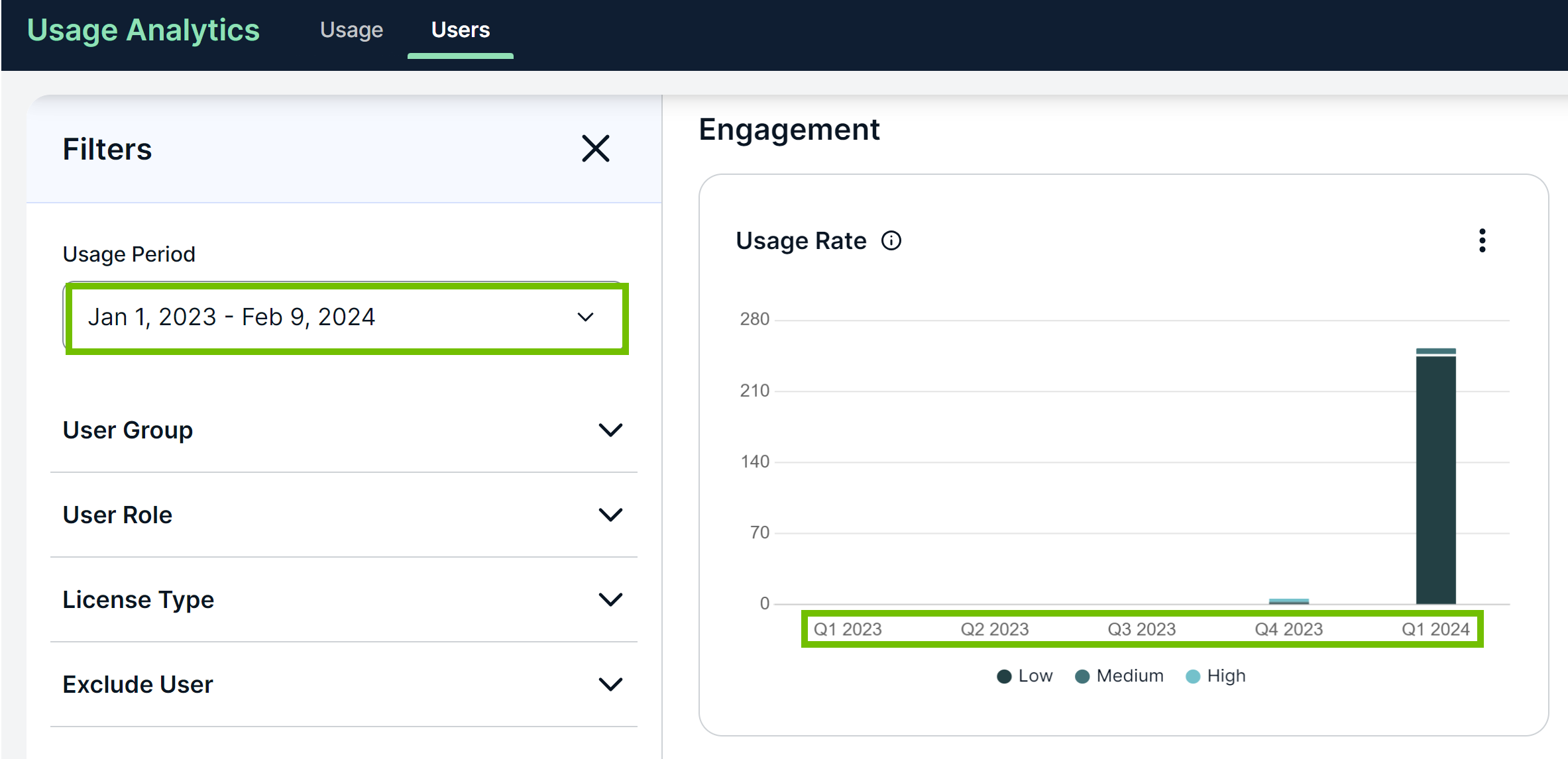
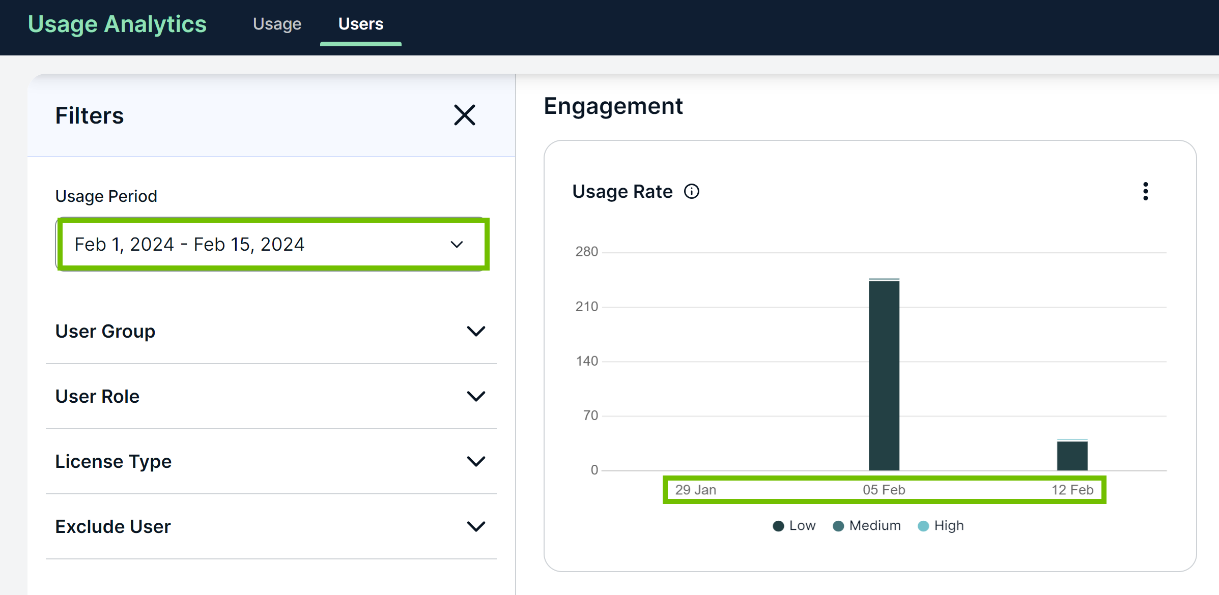
The time intervals shown in trend charts change depending on the usage period. For example, if the usage period you select spans more than 1 year, the period is divided into quarterly intervals. Similarly, for a usage period of 3 months, the period is divided into weekly intervals.

The following table shows the granularity for different ranges of the usage period, along with examples.
| Range | Granularity | Example | |
|---|---|---|---|
| Usage period | Intervals | ||
| Less than or equal to 2 weeks | Day |
Jan 1 - 4, 2024
|
|
| More than 2 weeks | Week | Jan 1 - 31, 2024 |
|
| Less than or equal to 3 months | |||
| More than 3 months | Month | Aug 1, 2023 - Jan 31, 2024 |
|
| Less than or equal to 1 year | |||
| More than 1 year | Quarter | Jan 1, 2023 - Jan 31, 2024 |
|
Start and end dates on the x-axis
