Improving the visual output of the Data Maturity report
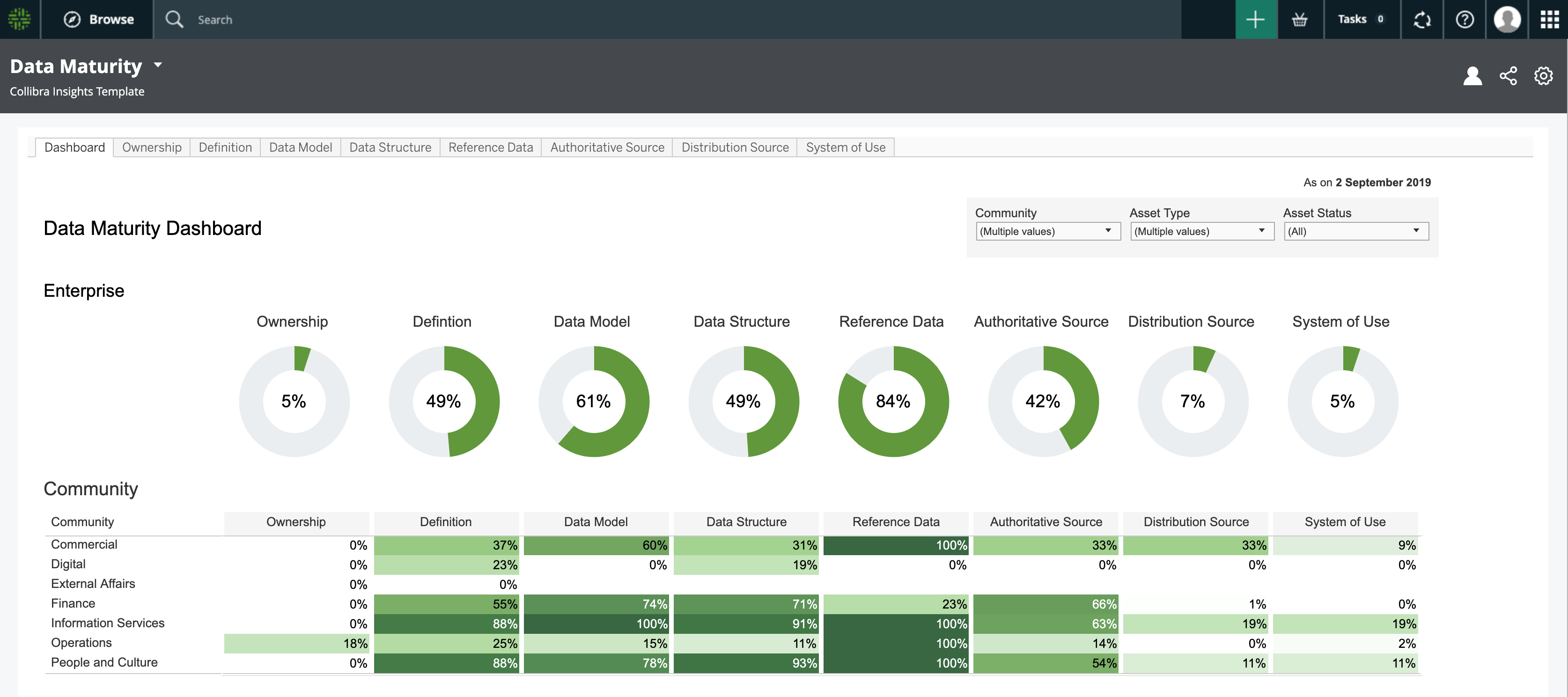
A well configured Data Maturity report will look something like the following image.
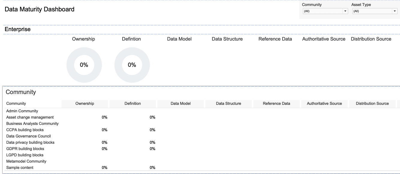
However, it's possible that you correctly configured the Data Maturity report, but it looks more like the following image.
Common scenarios and tips
Here are some common scenarios, explanations and tips for improving the visual output of the report.
In the following example image, the Ownership progress circle chart shows 0%.
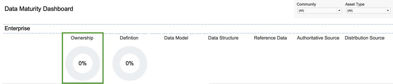
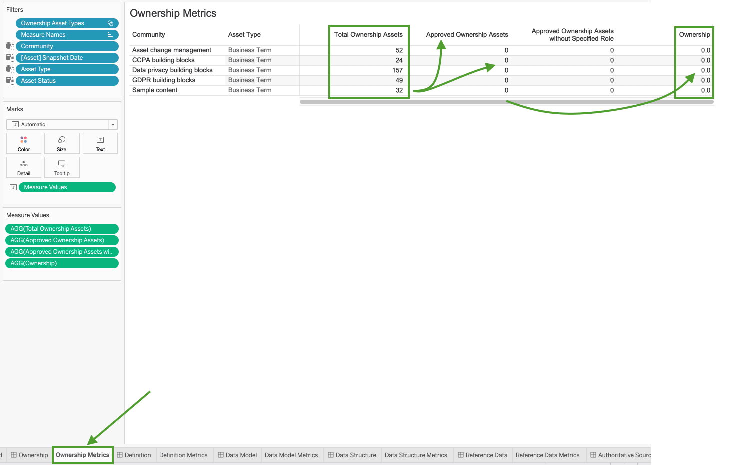
If you go to the Ownership Metrics tab, you see that there are many Business Term assets for inclusion in the report. One might expect that the presence of these assets would be reflected in the circle chart. However, the formula for calculating the percentage entails a division operation involving the number of assets with the status Approved. In this example, there are no assets that have the status Approved, and this "0" value results in an Ownership percentage of 0%.
Tip Keep in mind that progress circle charts are reliant on approved assets. In other words, the more mature the data set, the more meaningful the progress circle chart will be.
In the following example image, no progress circle chart is shown for the Data Model metric.
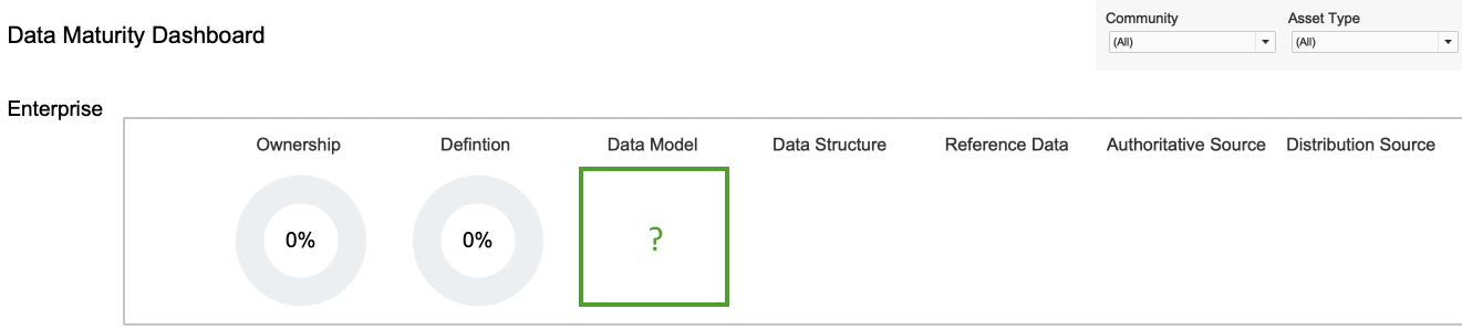
Tip Ensure that the relevant asset types are selected for the Data Model metric.
- At the bottom of the page, click the Data Model Metrics tab.

- In the Data tab, select Data Models Asset Types, and then select Edit Set.
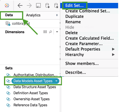
The Edit Set dialog box appears; however, no asset types are selected.
- Select the asset types that you want to monitor, for example Data Model, Data Entity and Data Attribute.
- Click OK.
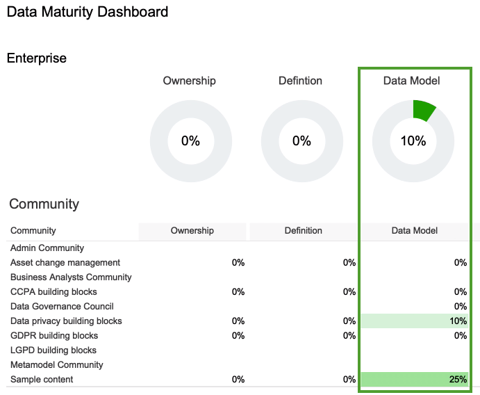
The data is now shown, in accordance with the selected asset types. Note Keep in mind that the formula for calculating the percentage entails a division operation involving the number of assets with the status Approved.
 - On the Dashboard tab, the progress circle chart is now shown for the Data Model metric.
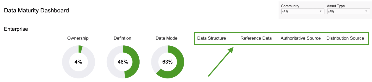
In this example image, we are not interested in the Data Structure, Reference Data, Authoritative Source and Distribution Source metrics, and want to remove them from the report.
Remove a single metric
- Select a single metric.
You might have to first select the section, for example Enterprise, and drag the frame so that you can click an individual metric.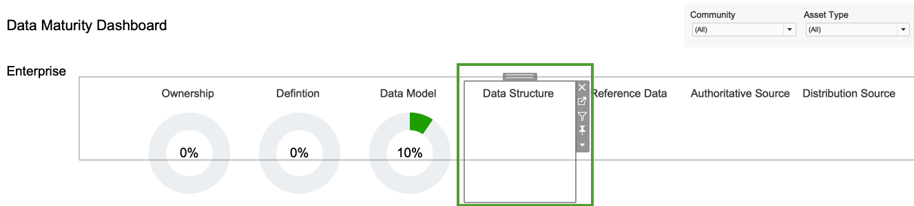
- Click the Remove from dashboard icon
 .
.
Remove several metrics at once
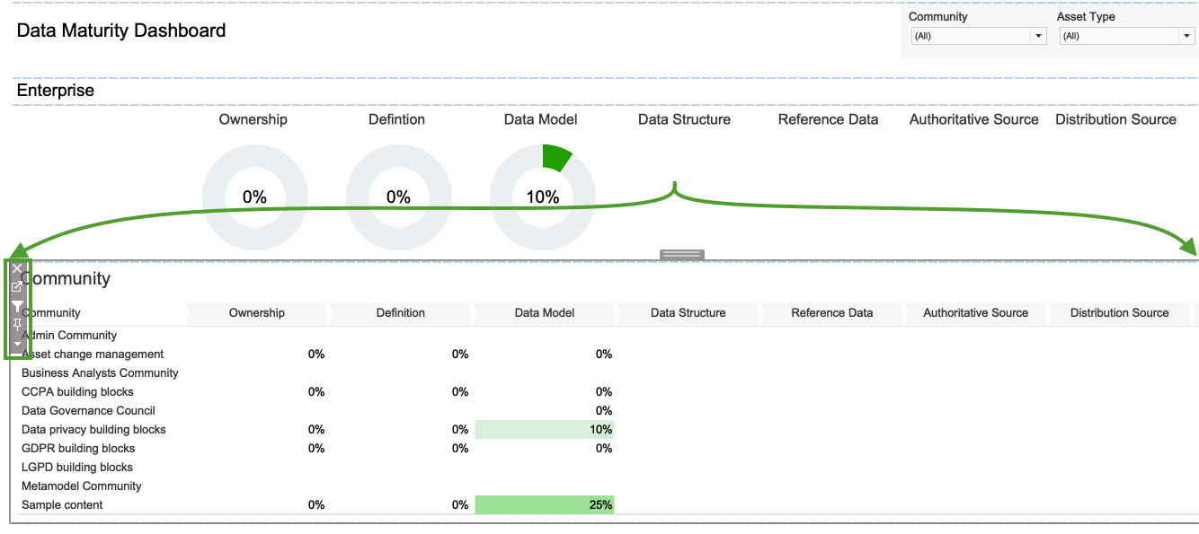
- Click in the Community section, so that the entire section is highlighted.
- Click the "go to sheet" icon
 .
.
The Community data sheet opens.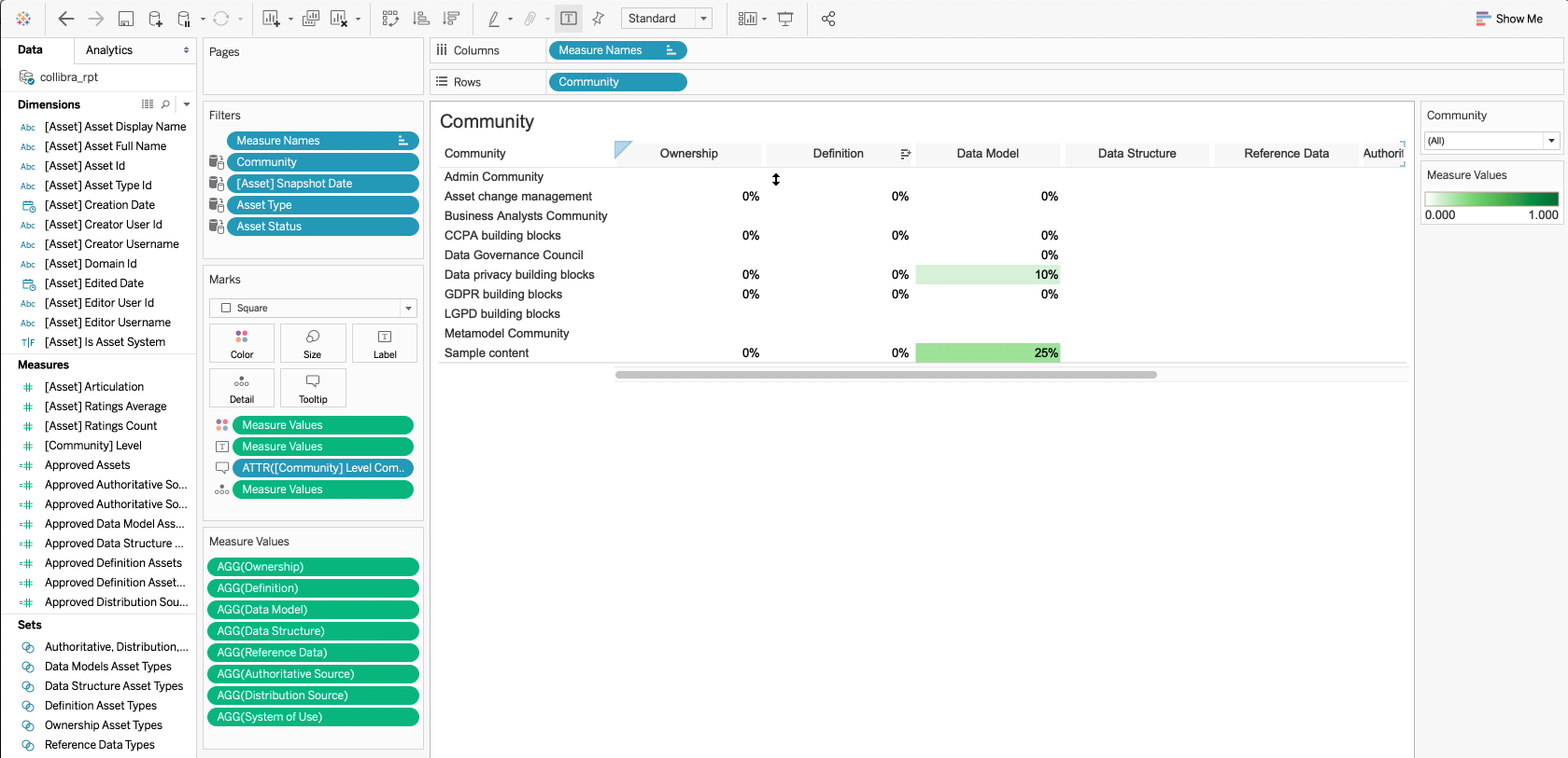
- In the Measure Values section, select the metrics that you want to remove.
In this example, we selected Data Structure, Reference Data, Authoritative Source and Distribution Source.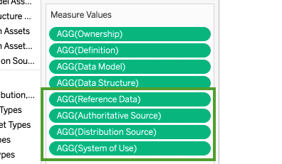
- Right-click on the selected metrics and select Remove.
The metrics at the Community level are deleted.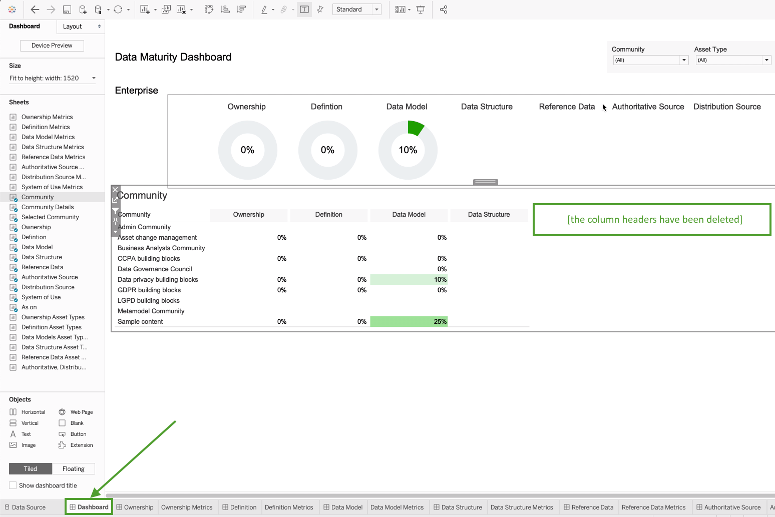
If assets that you expected to see in the report are not shown, it could be that the status of the assets are not correctly reflected in the relevant measures. By default, the reports are configured to show only assets with the status Approved. Assets with other statuses will not be shown in the reports.
The report templates, however, are fully configurable. You can edit the relevant measures, to include other statuses, such as Accepted.
- Click in the Community section, so that the entire section is highlighted.
- Click the "go to sheet" icon .
The Community data sheet opens. - In the Measure Values section, select the measure that you want to edit.
In this example, we selected Approved Definition Assets.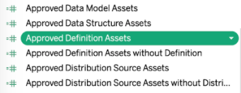
- Right-click on the selected measure and select Edit.
- In the calculation logic, change the asset status from "Approved" to the status you want, for example "Accepted".
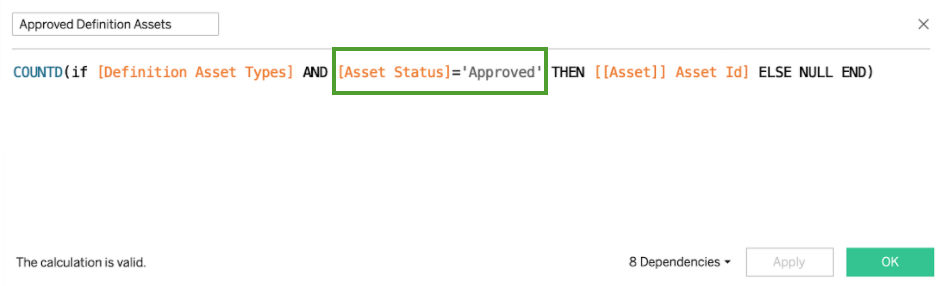
- Click OK.